Record Format in Dashboard Widgets
Welcome to another episode of SmartTips! Today we're diving into how to optimize the record format within a dashboard widget. Not many folks realize that you can click into a widget and see the records of information contributing to that visualization. Today, I’m going to show you how to make that absolutely perfect for your workspace dashboard. Let’s jump right in!
Getting Started: Exploring the Dashboard View
We'll start with the dashboard view that I have already built out.
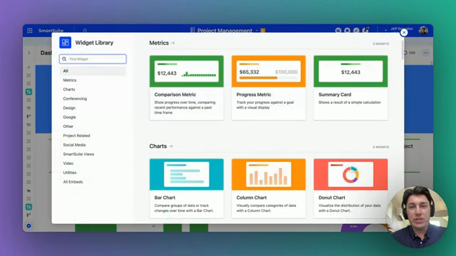
If you're curious about the widgets available within a dashboard view, simply hit Add Widget up in the top right-hand corner to see the entire menu of options. Today, we will be focusing on the comparison metric and a variety of charts. We'll explore how these different outputs can be customized to show you the list of records contributing to those numbers.
Adding and Customizing Widgets
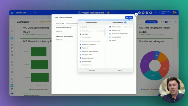
All widgets, despite their differences in appearance, share a similar functionality. If you click on the widget’s output, you will see a list of the records that contribute to that number. In the top right-hand corner of the modal, you can choose which fields of information you want to display about that record type.
For instance, suppose we're looking at a list of different projects:
- Project Type
- Project Owner
- Project Stage
- Budget Allocated
- Budget Spent
You can control which of these fields are populated in the view and which aren’t.
Managing the Display Limit
There is a limit to how many different records you can show at one time, so keep that in mind. The same functionality applies across all widgets, whether they're bar charts, column charts, or others.
When you click on a bar or a column, a modal pops up offering the flexibility to control which fields of information you see about those records.

Practical Examples
To help visualize this, let’s work through a practical example. Imagine we want to add a widget that tracks our project stages:
- Add Widget: Click the Add Widget button.
- Select Chart Type: Choose a Bar Chart for better visualization of the different project stages.
- Customize Fields: Once the widget is added, click on the output to open the modal and select fields such as project type, owner, stage, budget allocated, and budget spent.
By customizing these fields, you quickly get a tailored view of your project statuses.
Best Practices for Widget Optimization
Here are some best practices when optimizing your widget records:
- Limit the Number of Fields: Keep it to the most essential fields to avoid clutter.
- Use Consistent Naming: Ensure that field names are clear and uniform.
- Regular Updates: Update the fields regularly to reflect changes in data priorities.
"Remember, a well-organized dashboard is key to effective data analysis."
Conclusion
Taking the time to properly set up and optimize your widgets can significantly enhance the utility of your dashboard, making it a powerful tool for data analysis and decision-making.
To experience the future of work management firsthand, start your free SmartSuite trial today!
SmartSuite provides work platform for standardizing workflows in the following areas:
- Governance, Risk & Compliance
- IT & Service Ops
- Project / Portfolio Management
- Business Operations