You’ve spent countless hours tweaking tables, adjusting data views, and wrestling with information overload. Crafting a functional dashboard from scratch is no small task—and sometimes it’s even harder to make sense of the data in front of you.
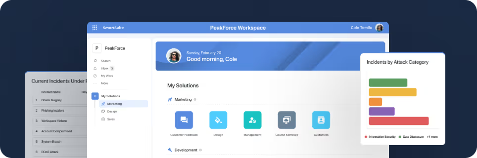
That’s why businesses looking for powerful, real-time insights into their operations are turning to tools like SmartSuite for dashboards. These dashboards function like mission control, offering interactive data stories that highlight key trends, bottlenecks, and patterns.
With SmartSuite Dashboards, you can effortlessly pull together data from across your workspace into one centralized view. Whether it’s tracking sales, managing projects, or monitoring risk, these dashboards help you access crucial metrics and take informed action instantly.
What You’ll Learn
1. How to match your data insights with the right widgets in SmartSuite Dashboards
2. Best practices for designing and optimizing SmartSuite Dashboards
3. Multiple ways to display data insights to match your workflow
4. Essential guiding questions to ask as you build your SmartSuite Dashboard
What are Dashboards in SmartSuite?
Dashboards in SmartSuite eliminate the clutter we often experience from scattered updates, bringing all essential information into one centralized view. As a single source of truth, a SmartSuite Dashboard not only organizes your data but also provides flexibility to:
- Quickly scan the dashboard to grasp key insights at a glance
- Display metrics, charts, and views that give an overview of progress and performance
- Easily access and interact with resources, helping you stay on top of tasks and workflows
- Integrate data from any solution in your workspace, creating a seamless flow of information
- Customize visual representations using widgets that link directly to relevant tables, data, and external content
Insanely versatile and efficient, SmartSuite Dashboards can evolve effortlessly over time, adjusting to changes in team structures, key metrics, or business goals with minimal effort.
General Dashboard Goals
Your data is ineffective if your team has to dig through it to find value. SmartSuite Dashboards provide centralized access to key metrics and insights, cutting out the clutter and ensuring you're communicating what truly matters.
⚙️ Centralized Data Visualization- Dashboards bring together critical metrics and data from across your organization into a single, streamlined view. Instead of hunting through multiple tools, all the information you need is right at your fingertips—empowering you to take action quickly.
📊 Real-Time Insights- In the fast-paced business world, outdated information can lead to costly mistakes. SmartSuite Dashboards deliver real-time data, allowing you to make quick decisions and respond proactively to changing conditions. Whether you're tracking sales performance or project progress, staying up-to-date is effortless.
🛠 Customization and Flexibility- Every department or role requires different data, and one size doesn’t fit all. SmartSuite Dashboards offer full customization, allowing you to tailor the dashboard to meet specific needs—whether you’re managing a team, monitoring goals, or tracking project milestones. Each user sees exactly what’s relevant to them.
🚀 Improved Efficiency- SmartSuite Dashboards eliminate the need to jump between systems. By consolidating data from various sources, they streamline workflows and boost productivity. This means more time focusing on work that matters, rather than searching for information.
🤝 Enhanced Collaboration- With shared, visual representations of important data, dashboards improve communication across teams. They create a common understanding and keep everyone aligned, reducing misunderstandings and keeping projects on track.
🔐 Permissions & Security- Worried about data access? The permissions you set in your solutions are mirrored in your dashboard widgets. Sensitive information stays secure, while authorized users have access to exactly what they need.SmartSuite Dashboards are designed to bring clarity, improve collaboration, and help your organization run more efficiently—all with minimal effort.
15 SmartSuite Dashboard Use Cases
You don’t need to be a pro to leverage the power of SmartSuite Dashboards. From tracking your team's progress to diving into campaign analytics, here’s a list of must-have widgets tailored for a range of business needs.
Sales
With SmartSuite Dashboards, you can seamlessly track sales goals and forecast metrics while managing KPIs and OKRs in real time. Spot bottlenecks or process inefficiencies at a glance, and make swift adjustments to keep your sales team moving forward. Dashboards provide instant access to the insights you need to analyze performance and take corrective action as challenges arise.


Marketing
Marketing teams manage diverse tasks and campaigns, and customizable dashboards provide the flexibility to track everything. Monitor live campaigns, track deliverables, and oversee design progress with tools like summary cards, comparison metrics, and column charts. Get a clear snapshot of campaign performance and pending tasks, keeping your marketing efforts organized and on track.


Client Engagements & Professional Services
Dashboards help professional service teams stay on top of client engagement. From tracking FAQs and contract statuses to managing assets and renewals, you get a clear view of everything with widgets like FAQ, Grid View, and Donut Charts, ensuring timely communication and smooth operations.


Creative Design
Creative design professionals can benefit greatly from using customizable dashboards to enhance their workflows and improve client communication. Dashboards help designers organize their projects, display key metrics, and showcase portfolios in a visually appealing and interactive format.


Software Development
Software development teams can use dashboards to stay informed about product releases, track bugs, and share updates with key stakeholders. With widgets like Textblock, Grid View, and Simple Banners, your team has a centralized hub for monitoring progress and delivering software with fewer issues.


Orders & Invoicing
Dashboards simplify order management and invoicing by centralizing customer and order details. With tools like Record Selectors and Record Details widgets, you can efficiently manage orders, track payments, and maintain a seamless invoicing process.


Goals & Objectives
Track progress on key goals and objectives with summary cards and comparison metrics. Dashboards give you a real-time overview of how well you're meeting your targets, allowing teams to stay aligned with company goals.


Project Management
Dashboards offer project managers a real-time view of project progress, from tracking completed projects to monitoring budgets and deliverables. Using widgets like Summary Cards, Bar Charts, and Grid View, you can quickly assess task statuses and project timelines, ensuring nothing falls through the cracks.


Inventory Management
Inventory management dashboards provide at-a-glance views of stock counts, purchase orders, and more. Widgets like Grid View help you monitor inventory levels, while Simple Banners ensure that key information is easily accessible.


Board Management
Keep board members informed with dashboards that track meetings, resolutions, and upcoming deadlines. Use summary cards and countdown widgets to monitor important dates and compare performance metrics across time periods, ensuring board decisions are timely and data-driven.


Portfolio Overview
Portfolio managers can benefit from dashboards by gaining a clear, real-time view of project statuses, budgets, and task progress. With a dashboard, they can quickly identify projects at risk, monitor actual vs. budgeted spend, and track task completion across the entire portfolio. This streamlined view helps them make data-driven decisions, allocate resources efficiently, and ensure all projects align with strategic goals.


Customer Service
Dashboards streamline customer service operations by giving teams quick access to case statuses, customer feedback, and service metrics. This real-time data helps teams address issues efficiently and improve overall customer satisfaction.


Risk Management (GRC)
Dashboards help risk management teams track risk assessments and identify potential vulnerabilities. With widgets like Progress Metrics and Donut Charts, teams can view average risk scores, assess risk categories, and track the status of assessments, ensuring risks are proactively managed and mitigated.


Bus Cont. Planning (GRC)
Dashboards for business continuity planning help teams ensure that critical operations remain functional in the event of disruptions. Use summary cards and comparison metrics to track approved plans, activated plans, and new plans, while column charts provide insights into plan types and categories. Dashboards keep your continuity plans on track and visible at all times.


Popular Widgets for Dashboards in SmartSuite
Widgets are the core components of SmartSuite Dashboards and where customization really takes off. At first glance, the variety of widgets might seem overwhelming, but that’s the beauty of it—you’re not restricted to any single workflow. Later, we’ll explore a Dashboard formula to show you how it all comes together.
If you’re just getting started with SmartSuite Dashboards, let’s dive into some popular widgets to ignite your creativity!
Metric Widgets

Metric widgets allow you to keep an eye on essential data points and trends, allowing managers and teams to make informed decisions and adjust strategies on the fly.
- Summary Card Widget: Key metrics in a simple, customizable format.
- Progress Metric Widget: Track progress toward defined goals.
- Comparison Metric Widget: See how metrics stack up by comparing performance over time
By using these widgets, teams can monitor
progress, identify bottlenecks, and ensure
they’re on track to meet their objectives.
Chart Widgets

Need to visualize your data quickly and effectively? SmartSuite’s Chart Widgets allow you to track workflows, monitor key metrics, and view data distributions at a glance.
- Chart Types: Choose from a variety of chart types, including line, bar, column, pie, and donut charts, to find the best way to represent your data.
- Chart Values: Add multiple data series, use aggregation functions like SUM or MAX, and display totals directly on the chart for easy monitoring.
- Grouping & Filters: Organize your data by grouping fields like sales region or project status and apply filters to zoom in on the most relevant information.
- Benchmark Line: Track progress toward goals by adding a visual benchmark line to see if key metrics are hitting their targets.
With these tools, SmartSuite’s Chart Widgets give you the flexibility to display important data in a way that’s easy to interpret and perfect for driving informed decisions.
SmartSuite View Widgets


SmartSuite View Widgets let you seamlessly display grid views, calendars, pivot tables, and more, giving you an interactive way to manage data right from your dashboard.
- Grid View Widget: Add a Grid View in your dashboard with options to inline edit, group, sort, and filter.
- Calendar Widget: Organize time-based data such as events and deadlines in a calendar format.
- Pivot Table Widget: Transform complex data into clear insights by organizing it into rows and columns.
- Chart Embed Widget: Embed a Chart view in your dashboard.
These widgets allow teams to interact with data directly on the dashboard, offering powerful insights and easy access to crucial information—all in one place.
Record Selector Widget


Record Selector Widget and Record Details Widget give you the ability to select, view, and interact with specific records directly from your dashboard. These widgets make managing linked data and tracking key details more efficient, with real-time updates and seamless integration across your workspace.
- Record Selector Widget: Select records from any table within your solution to filter, sort, and connect data across different tables and solutions. This widget is great for linking datasets and enabling dynamic, real-time interactions with other dashboard widgets.
- Record Details Widget: Display and edit key details from the selected records, offering a streamlined way to manage fields like customer information, project tasks, or sales deals directly from the dashboard. This widget can be customized to show only the fields you need and enables real-time updates for both viewing and editing.
These widgets are invaluable for creating dashboards that streamline workflows, enabling teams to access and manage data without leaving the dashboard. Whether you’re tracking customers, managing projects, or monitoring sales, SmartSuite’s Record Selector and Record Details Widgets keep everything connected and organized in one place.
Other Widgets


Here are some powerful widgets to help you bring in custom code, documents, or entire webpages:
- Custom Code Widget: Embed custom HTML or any webpage directly into your dashboard. Whether you need to display a Google Form, an external application, or another web-based object, the Custom Code Widget makes it easy to integrate custom content seamlessly.
- Text Block Widget: Add long-form content or reference documentation using SmartSuite's SmartDoc feature. This widget supports rich text formatting, making it ideal for embedding project guidelines, onboarding guides, or process documentation—anything where detailed content is needed to provide context on the dashboard.
- Webpage Widget: Display a live webpage within your dashboard, allowing you to integrate external resources. Whether you need to embed an external website or provide an iframe for a project, this widget brings in visual content from the web directly to your workspace.
These widgets give you the flexibility to enhance your dashboards with custom content and external resources, making SmartSuite the central hub for all your projects.
Embed Widgets

With Embed Widgets, you can bring in data, media, and more by embedding supported apps and websites directly onto your dashboard.
- Facebook: Embed Facebook pages, profiles, or feeds.
- Figma: Display Figma designs or prototypes.
- Google Docs, Sheets, and Slides: Embed Google documents, spreadsheets, and presentations.
- Google Meet and Zoom: Embed live video calls.
- LinkedIn and Twitter: Display LinkedIn posts or public tweets.
- Vimeo and YouTube: Showcase videos to share content and insights.
- InVision: Embed InVision designs or prototypes.
- Webpage: Embed any webpage.
These widgets let you seamlessly integrate external content, making your dashboard the central hub for everything your team needs in one place.
SmartSuite Dashboard Framework to Follow
If you're feeling unsure about how to design a SmartSuite Dashboard that meets both your functional and visual expectations, you're definitely not alone. Many businesses, whether new to SmartSuite or just scratching the surface of its capabilities, face the same challenge.
The truth is, the hardest part is getting started. One of the biggest hurdles in reporting is simple:If you don’t have a clear goal for your Dashboard, you’ll likely lose interest before it even becomes useful.To help, we’ve created a straightforward formula to guide you through the process of building a meaningful Dashboard.Always remember: the goal is to present key insights that are easy to understand and powerful enough to drive decisions. ⭐️Ready to see it in action? Let’s start with a Dashboard designed to track something we all need: Goals & Objectives

1️⃣ Define your Dashboard audience and data story
Title: Departmental Overview
Audience: Department Head
Problem: I need a high-level view of how my department’s goals, initiatives, and tasks are aligning with company objectives.
Data Story: I want to monitor progress on department goals, identify bottlenecks in tasks, and ensure our initiatives are moving forward toward company-wide quotas.
That is alright but we can do better. Let's narrow the focus and quality.
Refined Story:
Title: Departmental Performance Dashboard
Audience: Department Head
Data Story: I need a single dashboard that provides insights into department goals, initiatives, and task completion, helping me ensure alignment with the company’s objectives and timely completion of deliverables.Having a clear data story is critical to avoid confusion or focusing on the wrong Data Insights.
With clarity, you can focus on the data that matters most.
2️⃣ Choose the right Data Insights to support the data story
- Data Insight #1: Number of tasks in each stage (to track task progression across different initiatives).
- Data Insight #2: Count of overdue tasks (to quickly identify overdue tasks and ensure there are no more than 10 at any time).
- Data Insight #3: Department goals and details (to monitor all goals and their status).
- Data Insight #4: Progress against the department’s quota of 3 initiatives (to track initiative completion and ensure the quota is met).
- Data Insight #5: Number of initiatives completed this quarter (to compare progress across time periods).
The more specific your Data Insights, the better your dashboard will serve you in tracking performance and making timely decisions.
3️⃣ Select the widget for the reporting type
- Data Insight #1: Number of tasks in each stage
For this insight, we’ll use a Donut Chart Widget to visualize how tasks are progressing across different stages of completion.
.gif)
- Data Insight #2: Count of overdue tasks
To track overdue tasks and ensure we stay under the limit, the Progress Metric Widget will show how close we are to exceeding the threshold of 10 overdue tasks.
.gif)
- Data Insight #3: Department goals and details
The Grid View Widget will allow us to display all goals and their status in a structured, easy-to-read format.
.gif)
- Data Insight #4: Progress against the department’s 3 initiative quota
Here, we’ll use another Progress Metric Widget to visually track how close the department is to meeting or exceeding the company-wide quota of three initiatives.
.gif)
- Data Insight #5: Number of initiatives completed this quarter
To compare this quarter’s initiative completion rate with previous ones, we’ll use the Comparison Metric Widget.
.gif)
By selecting the appropriate widget for each Data Insight, you can easily access the information that’s most relevant to your department’s performance.
4️⃣ Organize your widgets to create a visual hierarchy and balance
Now it’s time to organize the widgets in your dashboard. Here are a few tips:
- Ensure that high-priority metrics like overdue tasks and department goals are placed at the top of the dashboard for easy access.
- Use a clear visual layout to group related widgets together (e.g., tasks and initiatives in one section, goals and progress in another).
- Make use of colors and alignment to highlight important insights and create visual separation between different data sets.
Version 1

Version 1 Thoughts:
- The Progress Metric Widget showing overdue tasks is front and center, ensuring immediate visibility with a red color to show warning.
- The Grid View showing department goals sits next to the task breakdown, allowing the department head to quickly compare progress.
Functionality:
- All important widgets are easily accessible without scrolling.
- Data Insights are clearly displayed and support the department's strategic goals.
Visual Thoughts:
- Having progress metrics next to goal-tracking metrics provides an intuitive layout for monitoring both task and goal performance.
Version 2

By organizing your dashboard thoughtfully, you ensure that it communicates insights quickly, clearly, and powerfully.
5️⃣ Ask your team for feedback
Now that your Departmental Performance Dashboard is set up, it's time to collect feedback from your team. Getting their input helps ensure the dashboard delivers the most relevant insights and functions effectively for day-to-day use. Let's review how it’s performing:
Functionality thoughts:
- All critical widgets, like Overdue Tasks and Goal Progress, are clearly visible at the top, so I don’t have to scroll down. ✅
- The dashboard effectively displays the Data Insights I need for tracking departmental goals, initiatives, and tasks in real time. ✅
Visual thoughts:
- The Overdue Tasks and Objectives Completed Toward Goal widgets are placed prominently at the top, making it easy to track task backlogs and goal achievement at a glance. ✅
- The Goal Details grid is well-aligned, offering a structured view of goals, their owners, and their progress. ✅
- The Tasks by Status pie chart provides a clear snapshot of where tasks currently stand in the workflow. Its placement next to goal-related widgets helps department heads quickly assess the status of tasks and compare it to overall goal progression. ✅
- The overall flow, from top-level metrics (tasks and goals) to detailed breakdowns (initiatives and tasks by status), supports an intuitive left-to-right navigation of the dashboard. ✅
By ensuring the right data and visual elements are in place, the dashboard helps the department head make informed decisions quickly and efficiently. Now it's time to gather direct feedback from your team to fine-tune the experience.
Collecting Feedback from Your Team
A good way to gather feedback is by embedding a Form directly into the dashboard. This can be done by:
- Creating a table to collect feedback
- Creating a form to capture feedback
- Embedding the form in a new dashboard tab called 'Feedback'

This way, team members can provide their input about the dashboard’s functionality and usability, allowing you to make adjustments based on their needs.
By collecting and analyzing this feedback, you can ensure that the Departmental Performance Dashboard remains an effective tool for tracking progress, identifying bottlenecks, and keeping your team aligned with company objectives.Incorporating feedback ensures the dashboard evolves with the team's needs, improving efficiency and providing the insights required to keep the department on track.
CTA: Now build your Dashboard
You nailed it!
Building dashboards in SmartSuite is not only simple but visually captivating. With a few clicks, you've transformed raw data into meaningful insights. Now, take what you've learned and build even more dynamic dashboards—whether for your team, executives, or personal use.
Dashboards aren’t just tools—they’re powerful visualizations that bring your business data to life. With everything in one place, you’ll gain clarity on performance, identify trends, and make smarter decisions faster. Whether you’re tracking sales, projects, or any workflow, the possibilities are endless.
If you’ve spent too long digging through spreadsheets or struggling with outdated tools, it’s time to let SmartSuite work for you. Build custom dashboards, monitor progress in real-time, and collaborate with ease—all while keeping tabs on what matters most. Ready to supercharge your insights?
Start your free trial today and unlock the power of SmartSuite Dashboards. 🚀
SmartSuite provides work platform for standardizing workflows in the following areas:
- Governance, Risk & Compliance
- IT & Service Ops
- Project / Portfolio Management
- Business Operations