



What's new in SmartSuite
New features inspired by our user community.
All Updates


Recycle Bin: Restore Team

Deleting a team used to be final, which made the safe move leaving unused teams inactive rather than removing them. Deleted teams now go to the Recycle Bin, where an Administrator can restore one.
Key Highlights
- Teams Are Recoverable: A deleted team now moves to the Recycle Bin instead of disappearing, so an accidental delete is no longer permanent.
- Administrator Restore: Members with the Administrator role restore a deleted team from the Recycle Bin, alongside the other items collected there.
- Membership Comes Back: Restoring a team returns it with its members, so you are not rebuilding the roster by hand.
- Cleaner Team Lists: With deletion reversible, you can remove teams you no longer use instead of parking them as inactive to stay safe.
- Access Reviews: Teams grant permissions, so recovering one that was removed in error keeps an access review from turning into a rebuild.
How It Works
- Delete a team as before, from Workspace Administration, Manage Teams, by opening the team and choosing Delete Team.
- The team moves to the Recycle Bin rather than being removed outright.
- Open the Recycle Bin, find the team among the deleted items, and choose to restore it.
- The restored team reappears in Manage Teams and can be used again wherever teams grant access.
- Setting a team to inactive is still there when you want to keep it in place but stop it granting permissions.
Removing a team is now a reversible action, so tidying up your workspace no longer carries the risk it used to.

Filter Widget: Multiple Operators in Dynamic Filters
Dynamic filters on a dashboard could only ask one question: is the value this. Filtering a widget to everything except a status, or everyone other than one person, meant building a second widget to get there. Dynamic filters now carry an operator you choose, so a single control can include or exclude.
Key Highlights
- Is And Is Not: Every dynamic filter now supports both operators, so one control can narrow to a value or exclude it.
- Operator Per Filter: Each filter in the widget carries its own operator, so one can include while another excludes in the same set.
- A Chosen Default: Pick the condition that is pre-selected when someone expands the filter, instead of always starting from Is.
- Changed On The Dashboard: Viewers switch the operator from the filter's footer without opening widget settings or editing the dashboard.
- Open Work At A Glance: Exclusion makes the common service view simple, filtering a ticket dashboard to Status is not Closed without a second widget.
How It Works
- Open the widget's Filters tab, add a dynamic filter on a field, and set its Default Condition to the operator you want pre-selected.
- The Default Condition setting sits alongside Selections, Default Value and Sort Values in the filter's settings dropdown.
- On the rendered widget, the filter footer shows the field label next to the operator as a dropdown, for example Status Is.
- Viewers change the operator there, choose values, then apply by clicking Apply, clicking outside the control, or pressing Enter.
- Conditions from the filter widget combine with a connected widget's own filters using AND, so the widget's existing filters are preserved.
Dynamic filters can now exclude as easily as they include, with the default condition yours to set and the operator the viewer's to change.

Mobile: Data Schema Widget
The map of how your tables connect is no longer something you have to be at a desk to read. Data Schema widgets now render on mobile dashboards, with the same table cards, relationship lines and automatic layout the web shows.
Key Highlights
- Schema On Mobile: Data Schema widgets now draw on dashboards in the mobile app instead of leaving an empty space on the card.
- Same Diagram As Web: Table cards, field lists, relationship lines, self-links and automatic layout match what the same widget shows on the web.
- Pan And Zoom: Unlock the card to pan and pinch to zoom the diagram without the dashboard scrolling underneath you.
- Full Screen View: The expand icon opens the diagram full screen, with zoom in, zoom out, fit to screen, and double-tap to reset.
- Permissions Respected: Tables a member cannot access, and the relationship lines running to them, are left out of the diagram.
How It Works
- Open a dashboard in the mobile app and the diagram scales to fit its card, with the widget name and description shown above it.
- Tap the padlock to switch the card between scrolling the dashboard and moving the diagram, then tap it again to resume scrolling.
- Relationship lines are drawn from Linked Record, Count, Rollup and Lookup fields. Member and team fields do not create lines.
- Configuration stays on the web, so settings such as showing all fields or including cross-Solution links carry over the next time the dashboard loads.
- If the widget has no Solution selected, or its Solution was deleted, a clear message appears in place of a blank card.
Anyone with access to the dashboard can now read a Solution's structure from a phone or tablet. Available on all plans.

Managed Secrets
API keys and tokens sitting inside script code are a liability every auditor asks about. Secrets now has a page of its own under Workspace Administration, where you store sensitive values once, reference them by name, and see exactly who revealed each one and when.
Key Highlights
- Dedicated Page: Secrets has moved out of the Script Engine and onto its own page in the left sidebar, directly below Script Engine.
- Values Out Of Code: Scripts and integrations reference a secret by name, so API keys, tokens and connection strings never appear in the script itself.
- Reveal Is Recorded: Every reveal saves the member's name and the time, giving Administrators an access trail for sensitive credentials.
- Usage Before Changes: The Used in column shows every script and integration depending on a secret, so you can check impact before rotating or deleting it.
- One Rotation, Everywhere: Updating a secret's value takes effect in everything that references it, so rotating a credential is a single edit.
How It Works
- Open Workspace Administration and select Secrets to see the list, search it by name, and sort by secret name.
- Create a secret with a name and a value. The value is encrypted on save, and only its last four characters are ever shown in the list.
- Revealing a value takes two steps: a warning that the action is recorded, then the full value in a read-only field with a Copy button.
- Editing lets you rename a secret without breaking references, or type a new value to overwrite the existing one. Values are write-only and never displayed.
- Deleting a secret that is in use lists the affected scripts and integrations, turns them off, then removes the secret. The action cannot be undone.
Credentials now live in one governed place, with a record of every reveal and a clear view of what depends on them. Available now under Workspace Administration.
AI: Updated Supported Models
The model picker in the AI Control Center has been brought up to date. The current generation from each provider is now available when you create an AI connection, models their providers have retired are no longer offered, and the price and capability details shown next to each one have been corrected.
Key Highlights
- Current Generation Models: The latest Anthropic, OpenAI, Google Gemini and xAI models are now selectable when you create or edit an AI connection.
- Retired Models Removed: Models their providers have shut down no longer appear for new connections, so you cannot pick one that fails on its first call.
- Accurate Tiers: Cost tiers and capability descriptions now match each provider's current pricing and documented inputs, including PDF and image support.
- Existing Connections Untouched: Connections already set up keep the model they are on, so running AI fields and automations are not affected.
- Budget Options At Every Level: Low-cost models sit alongside flagship ones, so high-volume tagging, extraction and summarization do not have to run on a premium model.
How It Works
- Open the AI Control Center and create or edit an AI connection to see the refreshed picker.
- Each model shows its provider, cost tier and the input types it accepts, so you can match the model to the job before you save.
- To move an existing connection onto a current model, edit the connection and choose the new one. The change applies to everything using that connection.
- Workspace Administrators manage AI connections, so the models in play stay consistent for everyone building in the workspace.
Choosing a model is now a decision about cost and capability rather than a guess about whether it still runs. The refreshed catalog is available now in every workspace where AI is enabled.
Mobile: Pivot Table Widgets on Dashboards
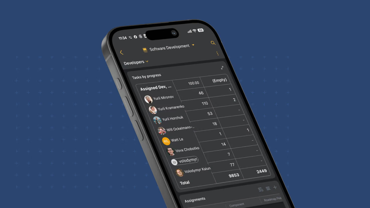
Pivot Table widgets now come along when your dashboards go mobile. A dashboard that contained a pivot used to show an empty space in its place in the SmartSuite mobile app, which left out one of the most useful summary views for anyone checking numbers away from a desk. The widget now renders on phone and tablet with the same cross-tab you see on the web, and it stays interactive: tap through to the records behind any number, or open the table full screen for a closer look.
Key Highlights
- The Same Numbers As The Web: Rows, columns, cell values, row and column totals and the grand total all match the web app, in light and dark themes.
- Formatting That Follows The Field: Currency, percent, precision, prefixes and suffixes display the way the summarized field is configured, and a combination with no records shows a dash.
- Pinned Headers: The header row and the first column stay in place while the rest of the table scrolls in both directions.
- Tap Through To Records: Tapping a cell opens exactly the records counted there. Row and column totals open that row or column, and the grand total opens every record behind the widget.
- Full Screen Tables: An expand icon in the widget header opens the pivot on its own screen, sized to the device, with drill-in still available.
- Record Selector Aware: A pivot scoped by a Record Selector widget follows the selected record, and its drill-in stays scoped to it.
- Built For Large Tables: Column widths authored on the web carry over, and tables at the 1,000-row or 1,000-column maximum load quickly and scroll smoothly.
How It Works
- Build or edit the Pivot Table widget on the web as usual. Configuration stays on the web, and the mobile app displays the result.
- Open the dashboard in the mobile app and the pivot appears in place, with its title and description.
- Scroll horizontally and vertically through the table, then tap any value or total to see the underlying records. Going back returns you to the dashboard.
- Tap the expand icon to view the table full screen.
- If a widget's row or column field has been removed, or you cannot access its table, the widget shows a clear message instead of an empty space.
The summaries your team relies on now travel with them. Available on all plans.

SmartSuite MCP Server
Your workspace is now reachable from any MCP-compatible AI assistant. The SmartSuite MCP Server is a hosted connector that lets an assistant explore your Solutions, work with records, and build and inspect configuration, acting as you and bounded by your own permissions. There is nothing to install and no API key to manage.
Key Highlights
- Zero Install: Connect from any MCP-compatible client at a hosted URL, with no API keys and nothing to run locally.
- Acts As You: Every call runs under your own sign-in, so an assistant sees and changes exactly what you could, never more.
- Scoped Consent: At connection you choose read-only or read and write, and which Workspaces the grant covers. Read-only is the default.
- Full Workspace Reach: Explore Solutions and Tables, search and edit records, manage comments and files, build Tables, Fields and Forms, and inspect Automations.
- Audit Trail Built In: Changes appear in the existing activity history attributed to both you and the assistant that acted for you, which matters for change management and evidence capture.
- Admin Control: Workspace Administrators set MCP access per user as Disabled, Read-Only, or Read and Write.
How It Works
- In Claude, open Customize, then Connectors, search for SmartSuite and click to connect.
- You sign in through SmartSuite's standard login, including social sign-in and SSO with multi-factor authentication where your organization requires it.
- On the consent screen you pick the Workspaces to share and whether the assistant may write. Read only and specific Workspaces are selected by default.
- Behind the scenes the connector uses OAuth with PKCE, so no password or API key is ever handed to the assistant.
- Workspace Administrators govern who can connect at all, and a user's existing Role and Permissions still bound everything the assistant can reach.
- Reads come back bounded by default, returning record title and URL rather than every field, so sessions stay fast and inexpensive.
Any assistant your team already uses can now work inside SmartSuite under your identity and your permissions. Available to all customers.
API: Turn off default fields for tables
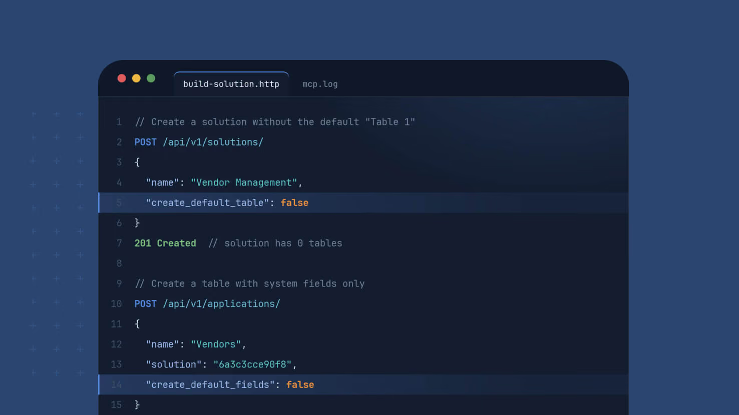
Building through the SmartSuite API used to start with cleanup. Every table created by the Create Table endpoint arrived with five default fields, and every solution created by the Create Solution endpoint arrived with a placeholder "Table 1", so any client that sent its own structure had to go back and remove what it never requested. Two optional flags now let a request skip those defaults entirely, so what you send is what gets built.
Key Highlights
- Tables Without Default Fields: Set create_default_fields to false on Create Table and Status, Priority, Due Date, Assigned To and Description are never created. The table holds its system fields plus the structure in your request.
- Solutions Without A Placeholder Table: Set create_default_application to false on Create Solution and the solution is created empty, with no "Table 1" to rename or delete.
- Fewer Calls, Cleaner Builds: Scripts and agents skip the follow-up requests that used to find and remove defaults, which shortens builds and removes a common source of confusion when an automated builder finds fields it did not plan.
- Nothing Changes Unless You Ask: Both flags default to true. A request that omits them behaves exactly as before, so existing integrations need no changes.
- Documented For Developers: Both parameters, their types, their defaults and example requests are covered in the API documentation.
How It Works
- Add "create_default_fields": false to a Create Table request. With an empty structure, the new table contains only the system fields: Title, First Created, Last Updated, Followed by, Open Comments and Autonumber.
- Send a custom structure alongside the flag and the table is created with your fields and the system fields, and none of the defaults.
- Add "create_default_application": false to a Create Solution request to create a solution with no tables, then add the tables you actually want.
- The flags are write-only. They shape what gets created and do not appear in the response body.
What you build through the API now matches what you asked for, from the first request. Available on all plans.
View Widgets: New Settings Panel
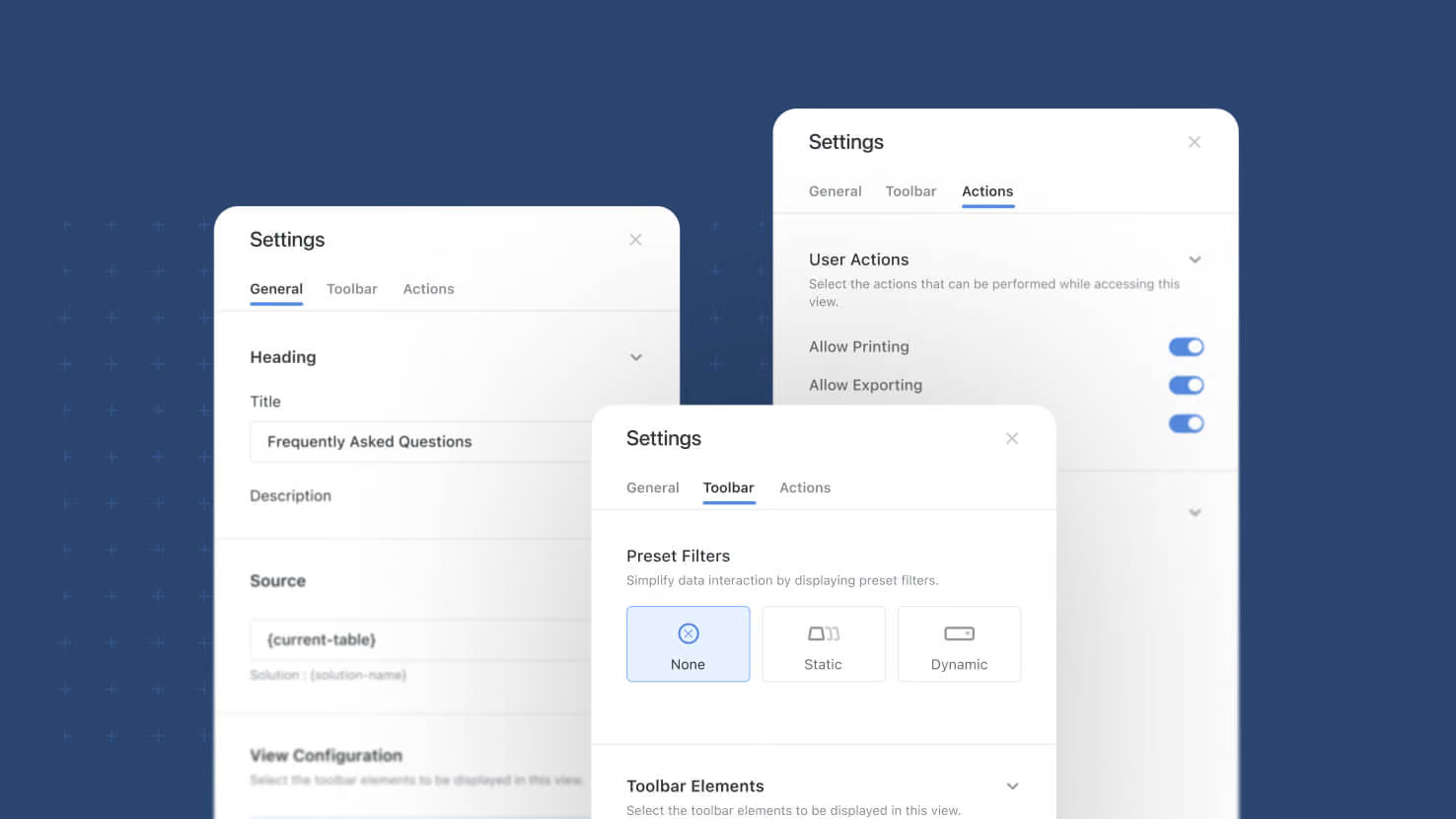
Configuring a dashboard view widget used to mean working through one flat panel where heading, source, display options and buttons all sat together. View widgets now open a three-tab settings sidebar, General, Toolbar and Actions, that groups every setting by what it actually does. The same structure applies across Grid, Card, Kanban, Timeline, Calendar and Gantt widgets.
Key Highlights
- One Consistent Layout: Grid, Card, Kanban, Timeline, Calendar and Gantt widgets all share the same three-tab sidebar, so settings sit where you expect them.
- Manager Defaults, Separately: The View Configuration section sets the default state of each toolbar control, distinct from what end users are allowed to change.
- Toolbar Visibility Control: Per-control toggles decide exactly which toolbar elements a regular user sees, with Show all and Hide all shortcuts.
- Governed User Actions: Printing, exporting, opening record details and inline editing are each their own toggle, useful when dashboard access needs to stay controlled.
- Preset Filters In Context: Preset filters move out of their own tab and sit alongside the toolbar visibility controls they relate to.
How It Works
- Open any view widget's settings and the sidebar presents three tabs, General, Toolbar and Actions, each built from collapsible sections.
- The View Configuration section lists the view's toolbar controls, each row showing its current default and opening that control's configuration popup when clicked.
- Toolbar Elements toggles govern what renders for the regular user; a control enabled in View Configuration loads in its configured state.
- Users can still adjust toolbar settings themselves during a session, and those changes are not written back as the widget default.
- Existing widgets migrate automatically, carrying over their View Controls settings; widgets that previously had Display Toolbar enabled start with all toolbar elements hidden.
The result is one predictable place to configure any view widget, with a clear line between the default a solution manager sets and what a person viewing the dashboard can change.

Mobile: Date Filters: Calendar Periods and Custom Units
Date filtering in the SmartSuite mobile app gains the full calendar vocabulary. Twelve calendar periods are available across week, month, quarter and year — Previous, Current and Next for each — so "Next month" on your phone means the first through the last day of next month, and quarter filtering is available for the first time. The counted options are presented as "The next number of…" and "The past number of…", each pairing a count with a unit picker for days, weeks, months, quarters or years, which keeps the value sheet short enough to work on a small screen.
Key Highlights
- Twelve Calendar Periods: Previous, Current and Next for week, month, quarter and year. "Current month" is the calendar month and "Next week" is the upcoming calendar week — the period the name describes, not a rolling range counted from today.
- Quarter Filtering On Mobile: Previous quarter, Current quarter and Next quarter resolve to calendar quarters. Checking what closes this quarter no longer waits until you are back at a desk.
- A Unit Picker Built For A Phone: Rather than ten separate counted options crowding the value sheet, mobile offers "The next number of…" and "The past number of…" with a unit control for days, weeks, months, quarters or years.
- Count Input With Guardrails: The count field accepts digits only and clamps to a whole number between 1 and 999, so a mistyped value cannot quietly produce a filter that returns nothing.
- Translated In Every Supported Locale: All of the new options carry translated labels across the sixteen locales the mobile app supports. No one sees a raw identifier.
- Scrolls On Small Screens: The value sheet scrolls so every option stays reachable, verified down to the smallest supported phone.
- Dashboard Widgets Included: Filter widget date presets and comparison widget week start follow the same vocabulary and the same locale-driven week start, so dashboards agree with the views behind them.
- First Created And Last Updated Stay Past-Only: These fields offer Previous and Current periods plus "The past number of…", and never offer future options.
- Saved Filters Keep Working: A condition saved before this release opens and stays selected. Nothing needs rebuilding.
- Same Results Everywhere: The mobile evaluator resolves periods and counted ranges exactly as the server does, so a filtered list on a phone matches what the same condition returns anywhere else in SmartSuite.
How It Works
- Open a view in the SmartSuite mobile app and tap into its filters.
- Add or edit a condition on a Date, First Created or Last Updated field, then tap the value.
- Choose from Today, Tomorrow and Yesterday, the twelve calendar periods, the two counted options, or an exact date or range.
- For a rolling range, tap "The next number of…" or "The past number of…", enter a count, and pick the unit.
- Apply. The list narrows to the same set the condition returns anywhere else in SmartSuite.
The full date-filter vocabulary, in your pocket. Available on all plans.
Sign-Up: Choose Your Data Region
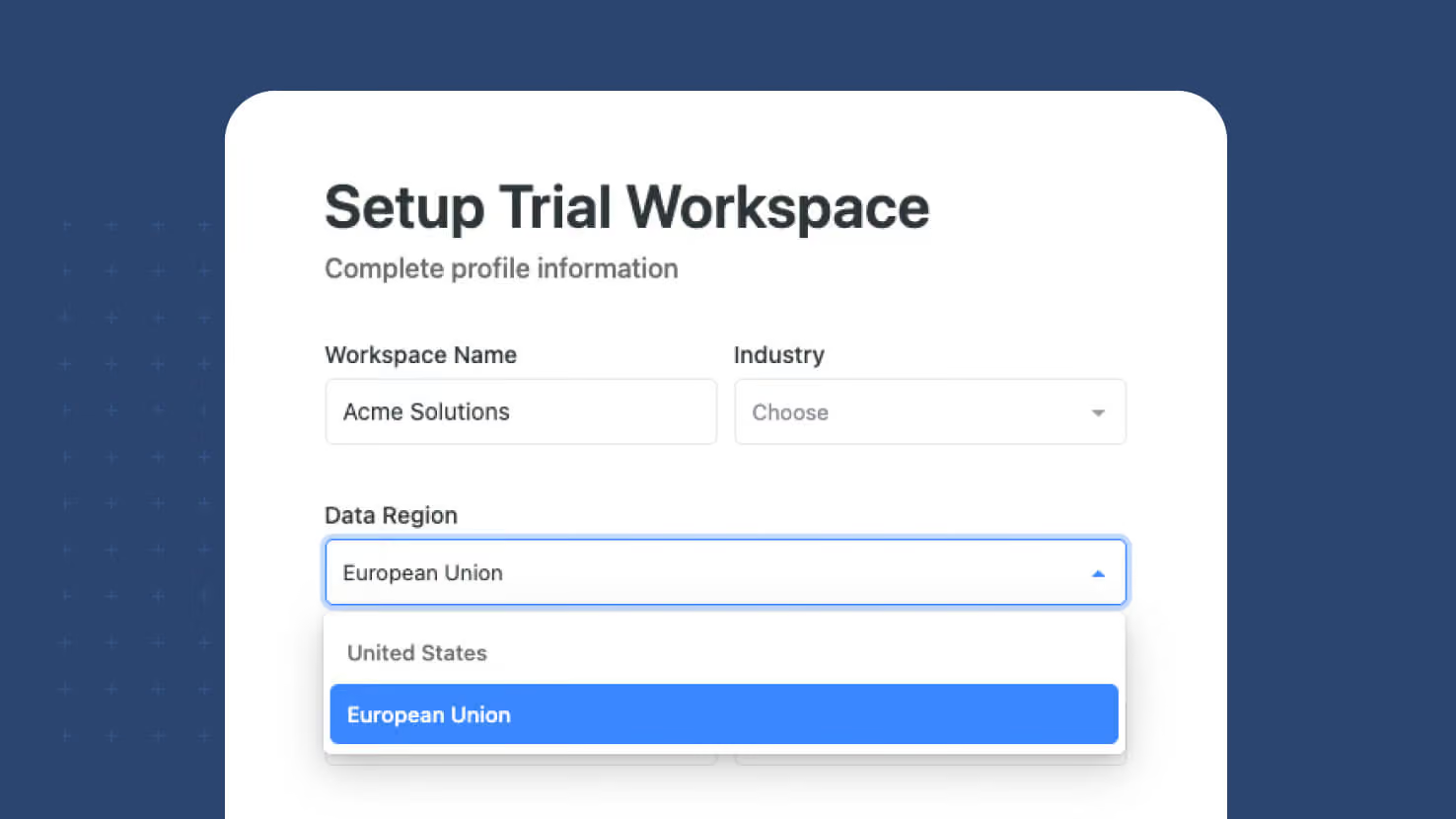
New SmartSuite workspaces now choose where their data lives. A region selector on the sign-up form lets you create your workspace in either the United States or the European Union, and the workspace is provisioned in the region you pick from the moment it is created rather than moved there later. The selector defaults to the region suggested by your location and appears on every path into a new workspace. Everything after that is automatic — the same address and the same login, with requests routed to your workspace's region behind the scenes.
Key Highlights
- Region Chosen At Creation: Pick the United States or the European Union while signing up. The workspace and its data are created in that region from day one, so there is no later migration and no window where records sit somewhere they shouldn't.
- Every Sign-Up Path Covered: The selector appears when a new user signs up with an email address, when a new user signs up with a social account, and when an existing user creates an additional workspace.
- Defaults To Your Location: The selector pre-fills the region suggested by where you are signing up from, so most people can accept the default and keep going.
- Survives A Refresh: The choice is held alongside the rest of your sign-up progress. Reload the page partway through and the region you picked is still selected.
- One Address, One Login: There is no separate regional URL to remember and no second set of credentials. Requests reach the right region automatically once the workspace exists.
- Invitations Follow The Workspace: Invites, shared links and logins all resolve to the workspace's region without anyone choosing again.
- Data Residency Without A Project: Teams working under regional data requirements can satisfy them at sign-up rather than through a migration, a support ticket, or a separate contract.
How It Works
- Start a new SmartSuite workspace from the sign-up page, with an email address or a social account.
- On the account setup step, choose your region. The selector is pre-filled based on where you are signing up from; change it if your requirements differ.
- Finish sign-up. The workspace, its tables and its data are created in the region you selected.
- Sign in as normal from then on. The region is a property of the workspace, so invitations, links and logins all resolve to it automatically.
- The region is set when the workspace is created, so choose deliberately if you have residency requirements to meet.
Where your data lives, decided in the first minute rather than the twelfth month. Available for all new workspaces at sign-up.

Date Filters: Calendar Periods and Custom Units
Date filter options now mean what their names say. Six options named after calendar periods — "The next week," "The past month" and their siblings — filtered rolling ranges anchored to today, so "next week" returned the next seven days rather than the upcoming calendar week. Those labels now carry true calendar meaning, "Past" becomes "Previous" to keep the distinction explicit, and twelve calendar periods are available across week, month, quarter and year. Quarters arrive as a filter unit for the first time. The rolling behavior moves to the parameterized options, which now pair a count with a unit picker for days, weeks, months, quarters or years.
Key Highlights
- Calendar Periods That Behave Like Calendar Periods: "Next week" is Monday through Sunday of the upcoming week. "Next month" is the first through the last day of next month. "Next year" is January 1 through December 31. No more rolling range hiding behind a calendar name.
- Twelve Periods, Four Units: Previous, Current and Next are each available for week, month, quarter and year. Current week, Current month, Current quarter and Current year are entirely new.
- Quarters, For The First Time: Previous quarter, Current quarter and Next quarter resolve to calendar quarters, with Q1 running January through March. "Everything closing this quarter" is now a single condition.
- A Unit Picker For Rolling Ranges: "The next number of…" and "The past number of…" keep their count and add a unit control for days, weeks, months, quarters or years. Ten unit-specific options collapse into two, so the value list stays short even as the vocabulary grows. Counts are accepted up to 999.
- Resolved-Range Preview: Every filter row shows the date range the condition actually resolves to, produced from the same resolution the filter itself runs. What the row says and what the grid returns agree.
- Week Start Follows Your Locale: Period boundaries come from each member's profile locale, so a Monday-first team and a Sunday-first team each see their own week.
- Comparison Operators Gain Periods: "is before," "is after," "is on or before" and "is on or after" accept calendar periods and parameterized values. Before a period means before its first day; after a period means after its last day.
- First Created And Last Updated Stay Past-Only: These fields get Previous and Current periods plus "The past number of…", and never offer future options.
- Saved Configurations Migrate Themselves: Every saved filter, view and dashboard using one of the six retired rolling options is rewritten to the equivalent parameterized option. No one needs to rebuild a filter.
- The API Is Additive: New mode names cover the new semantics, and existing modes keep their current behavior indefinitely. Nothing an integration sends today changes what it gets back.
How It Works
- Open any date filter and choose an operator. The value list now groups Today, Tomorrow and Yesterday, the twelve calendar periods, the two parameterized options, and Exact Date or Range.
- Pick a calendar period — Current quarter, say — and the condition resolves to that quarter's first and last day. The line beneath the row states the range, so there is nothing to work out.
- For a rolling range, pick "The next number of…" or "The past number of…", type a count, and choose the unit. "The past number of 3 quarters" is one condition.
- Counted ranges look forward from today or back to yesterday: the next N units includes today, the past N units ends yesterday, so no date matches both directions.
- Everything applies wherever date filters already work, including the filter panel, saved views, dashboard widget filters, spotlights, conditional display rules, document templates and exports.
Filters that read like the question you were asking. Available on all plans.
Linked Records: Dynamic Filters
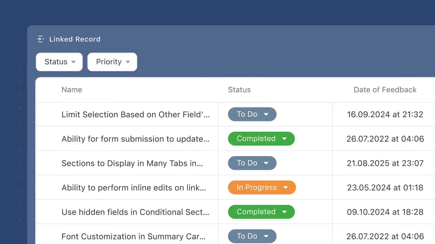
Linked Record fields pick up Dynamic Filters — viewer-facing filter controls that let end users slice the linked-record list without editing the field configuration. Configured on the new Filters tab of the Advanced Settings modal, Dynamic Filters render as a filter picker at the top of the Linked Record display surface so viewers can filter by any field on the target table at view time.
Key Highlights
- New Filters Tab: Under the Linked Record field's new Advanced Settings modal (also shipping this release), a Filters tab lets Solution Managers pick None, Static, or Dynamic.
- Viewer-Facing Filter Controls: Dynamic Filters render as a filter picker on the Linked Record's display surface (Record Page, Record Details Widget). End users choose values to narrow the visible list without touching the field configuration.
- Same Filter Widget Behavior: Dynamic Filters reuse the same functionality already implemented for the Filter Widget's dynamic filters — no new logic, no new UX. Solution Managers who already know Filter widgets already know Dynamic Filters.
- Configure Which Fields Users Can Filter By: Solution Managers configure which fields on the target table are exposed as filter dimensions. Common picks: Status, Assigned To, Due Date, Priority, any Single Select or Yes/No.
- Per-Viewer, Per-Session: A user's Dynamic Filter selections don't persist to other viewers of the same record. Each user gets their own live view.
- Preserves Underlying Links: Dynamic Filters change what displays, not what's linked. Every linked record remains linked at the data layer.
How It Works
- Open a Linked Record field's settings and click Advanced Settings.
- Switch to the Filters tab and choose Dynamic.
- Configure the filter dimensions viewers can use — which fields are exposed and in what order.
- Save. On the Record Page and Record Details Widget, users see a filter control at the top of the Linked Record field and can filter the visible records by the exposed dimensions.
- Filter selections are per-viewer and per-session — they don't change what's linked, and they don't affect what other users see.
Third of the three Linked Record enhancements shipping this release, alongside Advanced Settings (the container modal) and Static Filters (author-driven preset filter sets). Static and Dynamic Filters share the same Filters tab — pick one flavor per field. Available on all plans.
Linked Records: Static Filters
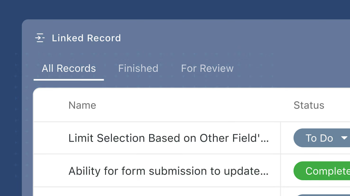
Linked Record fields pick up Static Filters — preset filter conditions on the field itself that let Solution Managers control which linked records display, without touching how records are actually linked. Configured on the new Filters tab of the Advanced Settings modal, Static Filters use the same condition builder that already drives Filter widgets and view controls. A default "All {record name}" filter is added automatically so users can always see the full set of linked records; additional filter sets can be added for common slices.
Key Highlights
- New Filters Tab: Under the Linked Record field's new Advanced Settings modal (also shipping this release), a Filters tab lets Solution Managers pick None, Static, or Dynamic.
- Static Filter Sets: Configure any number of named filter sets on a Linked Record field. Each filter set uses the same condition builder that already drives Filter widgets and view controls — no new syntax.
- Automatic "All" System Filter: When Static Filters is enabled, a system filter labeled "All {record name}" is added automatically. It shows every linked record, has a read-only label, and can't be removed — so users always have a way back to the full set. Solution Managers can reposition it in the list.
- Same Condition Builder: The Filter widget's condition builder is reused verbatim — no code duplication, no new UX to learn.
- Viewer Sees a Filter Picker: Configured Static Filters appear as a picker at the top of the Linked Record's display surface. Users switch between filters to see the corresponding slice of linked records.
- Preserves Underlying Links: Static Filters change what displays, not what's linked. Every linked record is preserved on the record; the filter is a display-time overlay.
How It Works
- Open a Linked Record field's settings and click Advanced Settings.
- Switch to the Filters tab and choose Static. The system adds an "All {record name}" filter automatically (read-only, non-removable).
- Add additional named filter sets using the standard condition builder — filter by field values, sort, group, whatever narrows the display to a useful slice.
- Save. On the Record Page and other Linked Record display surfaces, users see a filter picker at the top of the field and can switch between the configured filter sets.
- All linked records remain linked at the data layer; Static Filters only change what's displayed.
Second of the three Linked Record enhancements shipping this release, alongside Advanced Settings (the container modal) and Dynamic Filters (viewer-driven filter controls). Available on all plans.
Linked Records: Advanced Settings
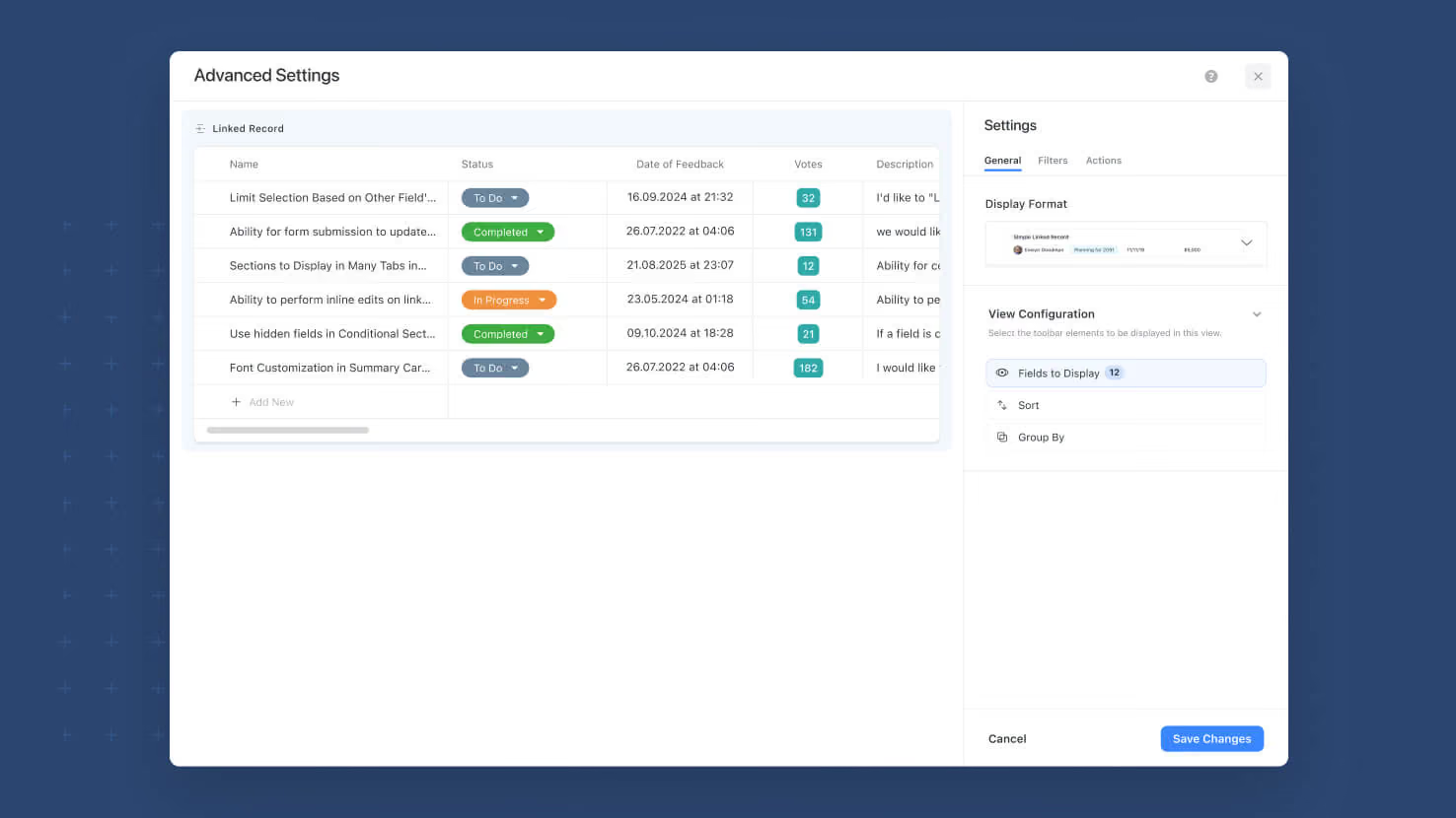
The Linked Record field settings pick up a new Advanced Settings modal that consolidates the display-configuration controls (Fields to Display, Group, Sort) and adds new capabilities on their own tabs. The modal opens with a live Preview on the left rendered from the last 50 records of the target table, and organizes settings across General (display format + Fields / Group / Sort), Filters (new — Static and Dynamic filters, ships alongside this release), and Actions (later phase) tabs. Simplifies the main Linked Record field settings screen while making the advanced surface much easier to configure.
Key Highlights
- New Advanced Settings Button: A single Advanced Settings button on the Linked Record field configuration opens the new modal. Fields, Group, and Sort controls move from the main settings screen into the modal so the main configuration surface stays clean.
- General Tab: Display format, Fields to Display, Group, and Sort in one place. Same functionality as before, better-organized surface.
- Filters Tab (new this release): Configure Static Filters (fixed conditions the viewer can't change) and Dynamic Filters (viewer-facing filter controls) on the Linked Record field. Ships alongside Linked Records: Static Filters and Linked Records: Dynamic Filters this same release.
- Actions Tab (placeholder): Reserved for a later phase.
- Live Preview: The left panel renders a live preview of the configured Linked Record using the most recent 50 records from the target table, so Solution Managers can see the effect of every configuration change without leaving the modal.
- Same Underlying Behavior: This is a UI reorganization plus a new Filters capability, not a change to how Linked Records themselves work. Existing configured Linked Record fields inherit the new modal automatically.
How It Works
- Open a Linked Record field's settings. In place of the previously-exposed Fields, Group, and Sort controls, an Advanced Settings button now appears.
- Click Advanced Settings to open the modal. The General tab loads by default with the display format, Fields, Group, and Sort controls.
- Switch to the Filters tab to configure Static or Dynamic filters on the field (or leave as None).
- Watch the live Preview on the left refresh as you change settings, sampled from the last 50 records of the target table.
- Save. Configuration applies to the Linked Record field everywhere it's referenced.
Second of three Linked Records enhancements shipping this release, following the Jul 27 Sticky Add New + Grouping and Aug 17 Dropdown Mode releases. Available on all plans.

Forms: Support for Checklist Field Type
The Checklist field type is now supported on Form Views. Solution Managers can drag a Checklist field onto a form and configure it with all the standard form field settings plus Checklist-specific settings for entry creation, default-entry editing, Due Dates, and Assignments.
Key Highlights
- Full Checklist Support on Forms: Every Checklist field type property that works inside the main app now works on a Form View, so form respondents can complete a Checklist as part of a form submission.
- Standard Form Field Settings: Required, Help Text, Default Value, Show only when conditions are met, and Display help text as tooltip all work the same way they do for every other field type on a form.
- Checklist-Specific Settings: Users can create new entries (default on), Users can modify and delete default entries (default off), Enable Due Dates (default on), Enable Assignments (default on) — each configurable per form.
- Permission-Aware Assignee Picker: When Assignments are enabled, the Assignee picker only shows members that have access to the target table. Same behavior as the Checklist field inside the main app.
- Notification Routing: When a checklist item is assigned through a form submission, a notification is generated for the assignee. Internal forms attribute the assignment to the submitter; public (Shared) forms attribute the assignment to the SmartSuite Form system user.
- Team Assignments Supported: The existing checklist_team_assignment workspace flag is respected on forms too — when the flag is on, Checklist assignments to Teams work on forms the same way they work inside the main app.
How It Works
- Open a Form View in edit mode and drag the Checklist field from the Left Side panel onto the form.
- Configure standard form field settings (Required, Help Text, Default Value, display logic) in the field's edit mode.
- Configure Checklist-specific behavior: entry creation, default-entry editing, Due Dates, Assignments.
- Publish or share the form. Respondents can add checklist items (if enabled), edit default entries (if enabled), set due dates on items (if enabled), and assign items to members (if enabled).
- When items are assigned, notifications route to the assignee. Internal form submissions attribute the assignment to the submitter; public form submissions attribute the assignment to SmartSuite Form.
Available on all plans.
Webhook Trigger: Optional and Required Fields
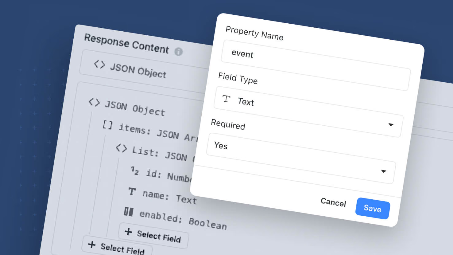
The Webhook Received automation trigger picks up per-field Required controls and a distinct Rejected run-history status. All fields in the webhook structure are non-required by default; toggle Required on the fields that truly matter, and requests that arrive without one of those fields return HTTP 400 to the caller (naming the offending field) plus a Rejected run in history — separate from Failed and Error. Non-required fields no longer break the whole run when missing. Incoming webhook payloads are now captured in Run History as an expandable tree (parsed and raw) for every run, including rejected ones.
Key Highlights
- Fields Optional by Default: A missing non-required field no longer rejects the incoming request.
- Per-Field Required Toggle: Turn on Required on the fields that truly matter — those become the gateway.
- Rejected Run-History Status: Gateway violations land as Rejected, separate from Failed / Error. No action steps execute.
- HTTP 400 Response: Rejected requests return HTTP 400 with the offending field name(s) in the body.
- Payload Capture in Run History: Incoming payload rendered as an expandable key:value tree, with a View Raw toggle for the raw body.
- Deterministic Handling of Empty vs. Absent: Present-and-empty, null, and absent all write empty; present-with-value uses the value.
- Extra Fields Ignored: Payload fields not in the configured structure are accepted and skipped, no error.
- Migration: All existing webhook automations move to the new behavior automatically.
How It Works
- Open a Webhook Received trigger. Toggle Required on the fields that truly matter.
- When a webhook arrives, the trigger checks Required fields first. A missing Required field returns HTTP 400 and records the run as Rejected — no action steps run.
- Non-required fields pass through. Downstream steps handle empty, null, and absent values deterministically.
- Open Run History to see the incoming payload on any run as an expandable tree, with View Raw for the raw body.
Available on all plans. All existing webhook automations migrate to the new behavior — no reconfiguration required.
Mobile: Power Search
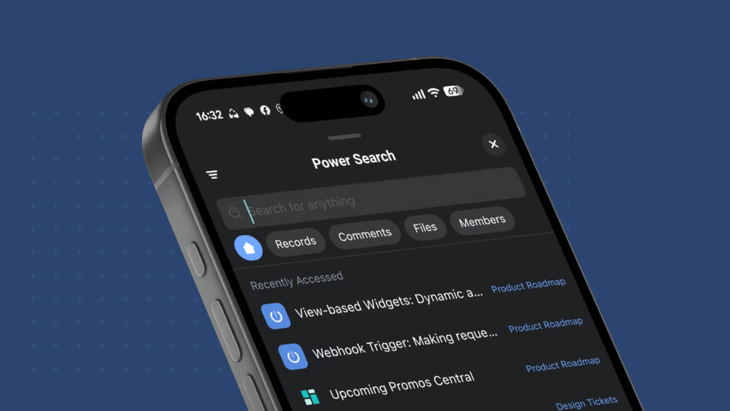
Power Search comes to SmartSuite Mobile. Tapping the Search icon on iOS or Android now opens a Power Search modal that reproduces the desktop experience — workspace-wide record search across every Solution and Table, with the same filter set that the desktop Power Search provides. Field service techs looking up a work order without remembering which Solution it's in, ITSM agents pulling up an incident from a customer name typed at the front desk, and PMO leads finding a task assigned to a specific member across every project all get the same "find anything from anywhere" experience mobile that they already had at their desk.
Key Highlights
- Workspace-Wide Mobile Search: Tapping the Search icon opens Power Search across every Solution and every Table — no more scoped-to-Solution or scoped-to-Table search.
- Desktop Filter Parity: Same filter set the desktop Power Search provides.
- Native Mobile UI: Not a mobile-browser fallback — matches the native experience across Grid, Calendar, Card View, Chart View, Internal Forms, and Shared Forms.
- No Configuration Required: Every mobile user picks up the new behavior automatically after updating the app.
- Continues the Mobile-Parity Arc: Jul 20 Calendar+Card View, Aug 3 Chart Widget, Aug 10 Internal+Shared Forms, and now Aug 31 Power Search.
How It Works
- Update the SmartSuite Mobile app to the latest version.
- From any screen, tap the Search icon to open Power Search.
- Type a search term to search record content across every Solution and Table. Apply filters to narrow.
- Tap a result to open the record.
Available on all plans. No configuration required.
Dashboards: View-Based Widget Preset Filters
View-Based dashboard widgets pick up a third filter layer: Preset Filters on the widget itself, configured in a new Filters tab. Solution Managers choose Static (fixed conditions the viewer can't change) or Dynamic (viewer-facing filter controls on the widget so dashboard consumers can slice the data themselves). Preset Filters combine with the existing Filter Widget and the widget's own Filter Control using AND logic. Shareable dashboards expose Dynamic Filter controls to recipients with the full record set intact.
Key Highlights
- New Filters Tab on the widget configuration modal, with a Preset Filters section (None / Dynamic / Static).
- Static Preset Filters: fixed conditions every viewer sees the same way.
- Dynamic Preset Filters: viewer-facing controls so dashboard consumers can slice the data themselves.
- Same Condition Builder used across SmartSuite — no new syntax.
- Three Filter Layers combine as AND-joined condition groups (Filter Widget + Filter View Control + Preset Filters).
- Switching Preset Type preserves your configured conditions.
- Shareable with the full record set: Dynamic controls surface for recipients with no pre-selection applied.
How It Works
- Open a View-Based widget's configuration modal on a dashboard.
- Go to the new Filters tab. In Preset Filters, choose Dynamic or Static (or leave as None).
- Configure the filter conditions with the standard builder.
- Save. Static filters apply to every viewer; Dynamic filters render as a viewer-facing control on the widget.
Available on all plans.
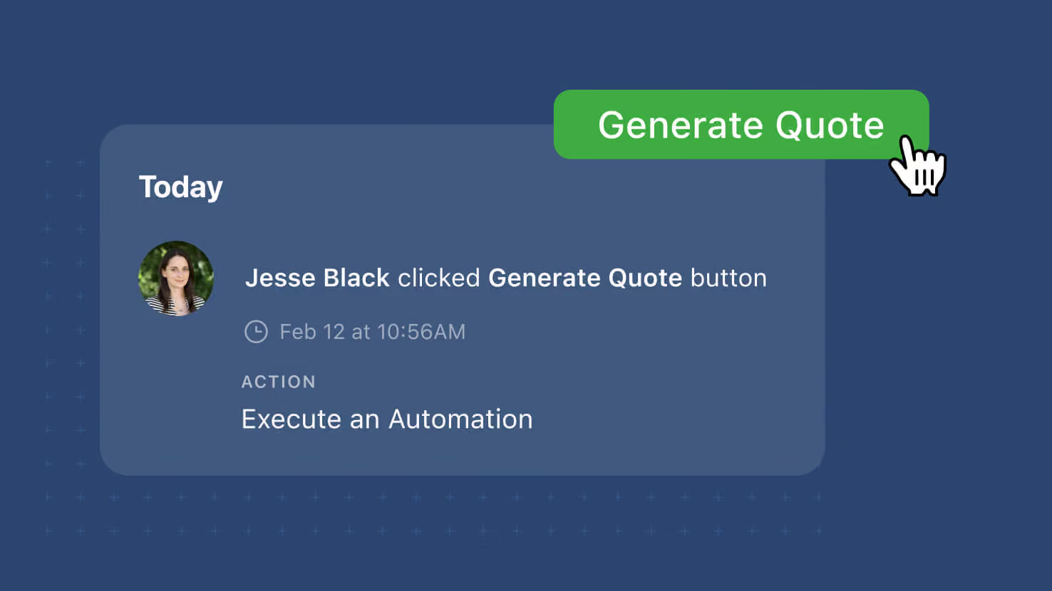
Button Field: User Context in Click Event History
The Button field's click events on a record's activity history now record the user who clicked and the action that ran (Create a Record, Open a Form, Open URL, or Run an Automation). Button-driven workflows that dispatch actions from a record — service-desk agents opening a ticket-creation form, GRC reviewers launching an automation to snapshot evidence, PMO leads clicking through to a linked record — now have per-user attribution in the audit trail instead of an anonymous "button was clicked" entry.
Key Highlights
- User Attribution on Every Click: Activity history now identifies the user who clicked the button by name.
- Action Type on Every Click: The log entry also records which action ran — Create a Record, Open a Form, Open URL, or Run an Automation.
- Click Events Remain Separate: Button click events continue to be logged as their own events, never grouped with other field changes.
- Covers Every Button Action Type: All four Button action types capture the same enriched context.
- Covers Every View That Supports Clicks: Grid, Card, Kanban, and the record edit surface all route their Button clicks into the same enriched activity log. Linked Records too.
- No Configuration, No Backfill: Existing Button fields inherit the enriched logging automatically.
How It Works
- Users click a Button field on a record. The configured action runs the way it always has.
- Open the record's activity history. The click event now shows the user's name and the action that ran.
- Auditors, incident reviewers, and compliance teams can trace per-user attribution directly on the record's own activity history.
Available on all plans. No configuration required; existing Button fields inherit the enriched logging automatically.
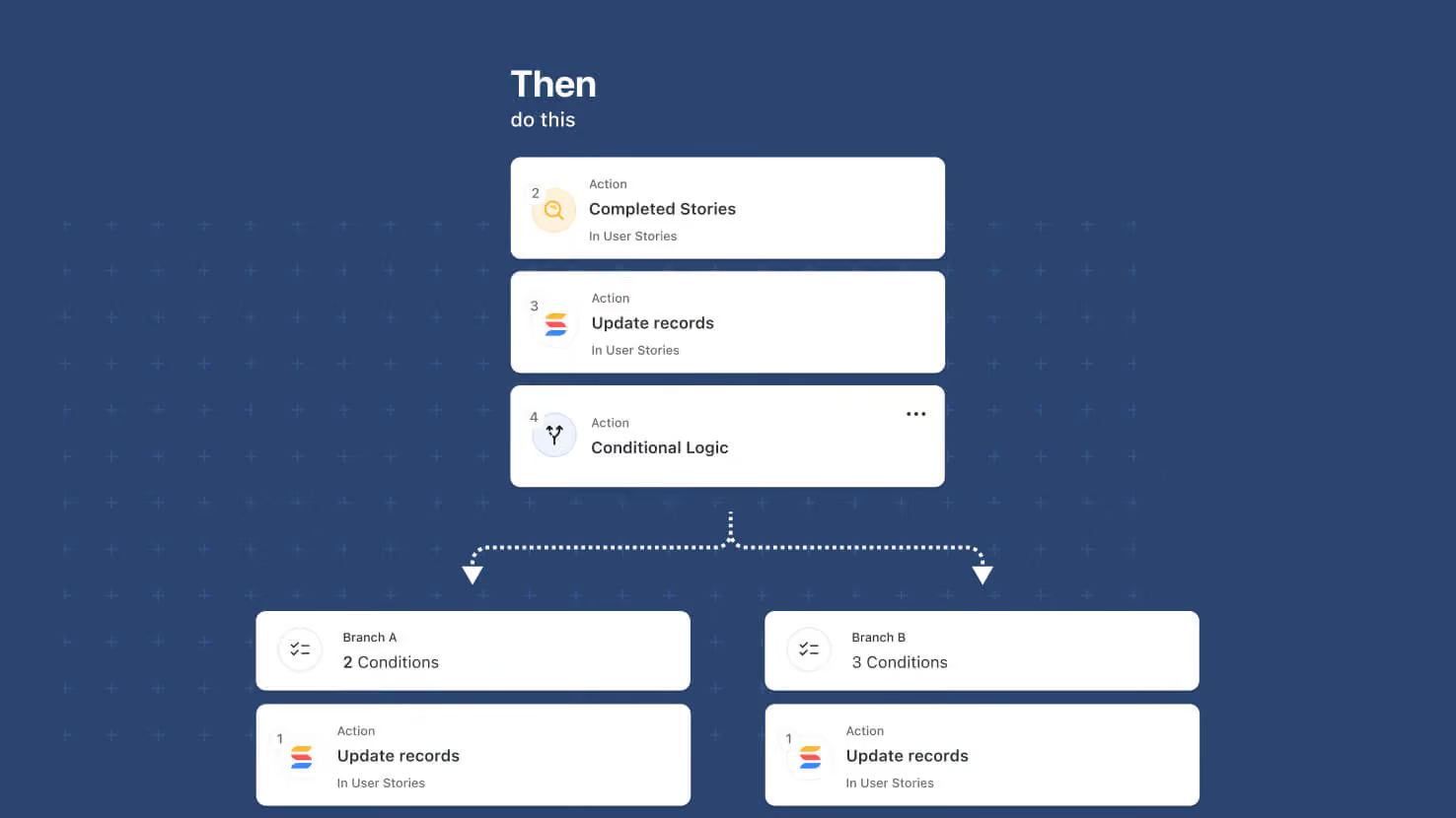
Automations: Advanced Logic Nesting
Automations' Advanced Logic building blocks — Conditional Logic (new this release) and Repeating Actions (Looping) — can now be nested inside each other, up to two levels deep. That unlocks multi-level workflows: a branch inside a branch, a loop inside a branch, a branch inside a loop, and a loop inside a loop.
Key Highlights
- Four Nesting Combinations: A Conditional Logic branch inside another Conditional Logic branch, a Repeating Action loop inside a Conditional Logic branch, a Conditional Logic branch inside a Repeating Action loop, and a Repeating Action loop inside another Repeating Action loop.
- Two Levels of Nesting: Advanced Logic actions are available at the top level and at one nested level.
- All Other Action Types Unaffected: Updates, notifications, integrations, record creation, and every other automation action type remain available at every level of nesting.
- Same Editor Experience: The condition builder inside a nested branch works the same way as at the top level.
- Full Traceability: Run History expands each nested step so teams can trace which branch ran and which items in a loop went where.
How It Works
- Open an automation and add a Conditional Logic action or a Repeating Action.
- Inside a branch or a loop, add another Advanced Logic action to create a second level of nesting.
- Inside that second-level action, add non-Advanced-Logic actions. Further Advanced Logic nesting is not offered at this level.
- Save the automation and open Run History to trace how each execution resolved through the nested levels.
Ships alongside this release's Conditional Logic launch. Available on all plans.
Automations: Slack Actionable Notifications
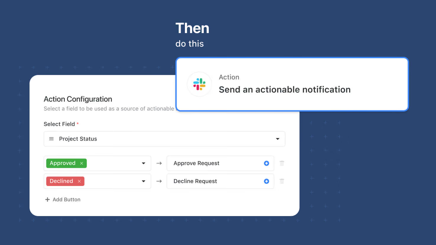
Automations can now send Slack messages with actionable buttons that update a SmartSuite record when clicked. Solution Managers pick a target record, compose the message, and choose a Status, Single Select, Multiple Select, or Yes/No field on the record as the button source — Slack recipients get up to three buttons and clicking one sets that field to the corresponding value in SmartSuite. Approval flows for contract sign-off, expense review, PTO requests, or GRC control attestations run entirely inside Slack while the audit trail lands on the SmartSuite record.
Key Highlights
- New Automation Action: "Send an actionable notification" under Slack in the automation action picker.
- Up to Three Action Buttons: Buttons are sourced from a Status, Single Select, Multiple Select, or Yes/No field on the target record.
- Channel or DM: Send to a Slack Channel or an Individual Slack user.
- Permission-Aware: The Slack user who clicks a button is matched to a SmartSuite Member by email, and their record permissions are checked before the update runs.
- Full Audit Trail: Successful updates land on the record's activity history with the Slack user's name and the automation name attached. Failed attempts are captured as comments on the record on behalf of SmartSuite Automation.
How It Works
- A Workspace Administrator enables the Slack integration from Workspace Settings → Security → Access.
- Solution Managers add the "Send an actionable notification" action to an automation and pick the target record.
- Compose the message title and content — rich text formatting and inline field values supported.
- Pick the field on the target record to drive the buttons. Add up to three buttons with field values and labels.
- Save and enable. When it fires, the recipient sees the message with buttons in Slack.
Requires the Slack integration enabled at the workspace level. Available on Enterprise and Signature plans.
Automations: Conditional Logic
Automations pick up a new Conditional Logic action that lets a single automation take different paths depending on record data. Solution Managers build conditions with the standard condition builder, then place the actions that should run when conditions are met and the actions that should run when they aren't. Route ITSM tickets to the on-call team when priority is high, auto-approve purchase requests under a threshold and route larger ones for review, or send only backordered line items down a follow-up path inside a Repeating Action loop.
Key Highlights
- Single Automation, Multiple Paths: Replace the pattern of duplicated automations with a single automation that branches based on record data.
- Standard Condition Builder: Conditions use the same control that already drives filters and automation conditions — AND/OR combinations, grouped condition sets, all field types supported.
- Any Action Type in Either Branch: Both branches accept any of SmartSuite's automation action types — updates, notifications, record creation, integrations, and more.
- Per-Item Evaluation Inside Repeating Actions: Placed inside a Repeating Action loop, Conditional Logic evaluates once per item in the loop.
- Nesting Support: Pairs with this same release's Advanced Logic Nesting to allow branches inside branches, loops inside branches, branches inside loops, and loops inside loops (two levels deep).
How It Works
- Open an automation and add an action. Choose Conditional Logic from the action picker.
- Build the conditions in the standard condition builder.
- Add the actions that should run when the conditions are met to the first branch, and the actions that should run when they aren't to the second branch.
- To evaluate per item inside a loop, place the Conditional Logic action inside a Repeating Action.
- Save and enable. Open Run History to see which branch ran for each execution.
Solution Managers and Workspace Administrators can build and edit these automations. Available on all plans.
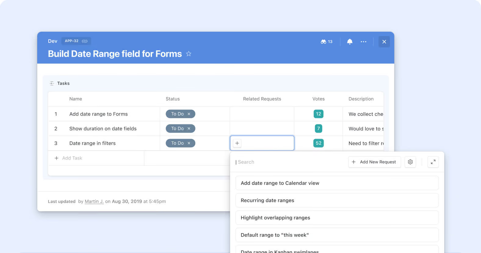
Linked Records: Record Selector Dropdown Mode
The Record Selector on Linked Records now opens as an inline dropdown by default instead of a full modal. Picking from a short list of existing records to link takes one click and no modal round-trip; the modal experience is still available for longer lists and advanced browsing. Service desks assigning a ticket to one of a small set of Change Requests, sales teams linking a deal to an Account from a short recent-account list, GRC compliance teams connecting a control test to a filtered short-list, and PMO leads connecting a task to a Sprint from a handful of active options all get quicker linking on the common case.
Key Highlights
- Dropdown by Default: The Record Selector now opens as an inline dropdown when users click into a Linked Record cell, cutting the full-modal round-trip out of the common single-click pick.
- Same Records, Same Configuration: The dropdown surfaces the same records the modal would show — same Solution-Manager-configured static and dynamic filters, same sort order, same Fields configuration, same Grouping (from the Jul 27 Grouping for Record Selector release).
- Modal Still Available: When users need the richer browsing experience — grouped views, filter panels, advanced controls that don't fit inline — the modal is one click away as an expansion from the dropdown.
- Inline Search: Users can type in the dropdown to filter the visible records, the same way they would inside the modal.
- No Configuration Migration: Existing Linked Record fields inherit the dropdown default automatically; no Solution Manager action required, no data changes, no configuration migration.
How It Works
- Open a record and click into any Linked Record cell to open the Record Selector. The Selector opens inline as a dropdown by default.
- Scroll through the visible records or type to search within the list; click a record to link it. No modal opens.
- When the dropdown isn't enough (long list needing filter panels, grouped browsing, or other advanced controls), click the expand affordance to open the full modal instead — same records, same configuration, richer surface.
Third refinement in the Linked Records 2.0 arc, following the Sticky Add New button and Grouping for Record Selector from Jul 27. Pure UX change — no new business logic, no configuration to migrate. Available on all plans.