Are you trying to figure out how you can use visual project management to simplify your workflows?
I believe that every story is best told with a visual.
Projects are kind of stories – with multiple characters, doing different things. A visual representation of the story can work wonders for the audience (both internal and external stakeholders) to understand your project management process.
In this guide, I’ll explain in great detail what visual project management is and then show you 10 different ways of visualizing your tasks.
Let’s begin with the fundamentals: ⤵️
What is visual project management?
Visual project management is an approach in project management that uses visualization tools, such as Kanban boards, Gantt charts, and timelines, to better organize, track, and communicate project tasks, deadlines, and progress.
Put simply, visual project management simplifies complex workflows by presenting information in graphical formats that make it easier for your team to understand the milestones, tasks to be done, and dependencies in an easy-to-understand way.
➡️ I’ve been through the era of project management where everything was written in documentation, and our team had to read through it all to understand what they had to do.
💡In 2025, you can reduce that reliance on heavy documentation and skip towards visual project management that will help you provide a bird’s eye view of the tasks to be done for your team and improve communication.
Visual project management vs. regular project management: What’s the difference?
The main difference between visual project management and regular project management is how information is presented and communicated:
- Visual project management uses tools like Kanban boards, Gantt charts, and flowcharts to display tasks and workflows visually.
- Regular project management relies on text-based documentation and spreadsheets.
- Visual project management makes it easier for your team to quickly understand project status, priorities, and bottlenecks at a glance.
- On the other hand, regular project management often requires more time-consuming reviews of detailed reports and manual updates to track progress.
➡️ The way I see it is that regular project management, as it was done 20-30 years ago, is better suited for compliance-driven projects that require detailed documentation and formal processes.
Digital and modern teams can leverage visual project management’s diagrams and visual boards to better consume project information and more easily access information.
10 examples of visual project management tools
Now that we’ve got the basics out of the window, I wanted to show you 10 examples of visual project management by using the visualization tools available at SmartSuite (that’s us): 👇
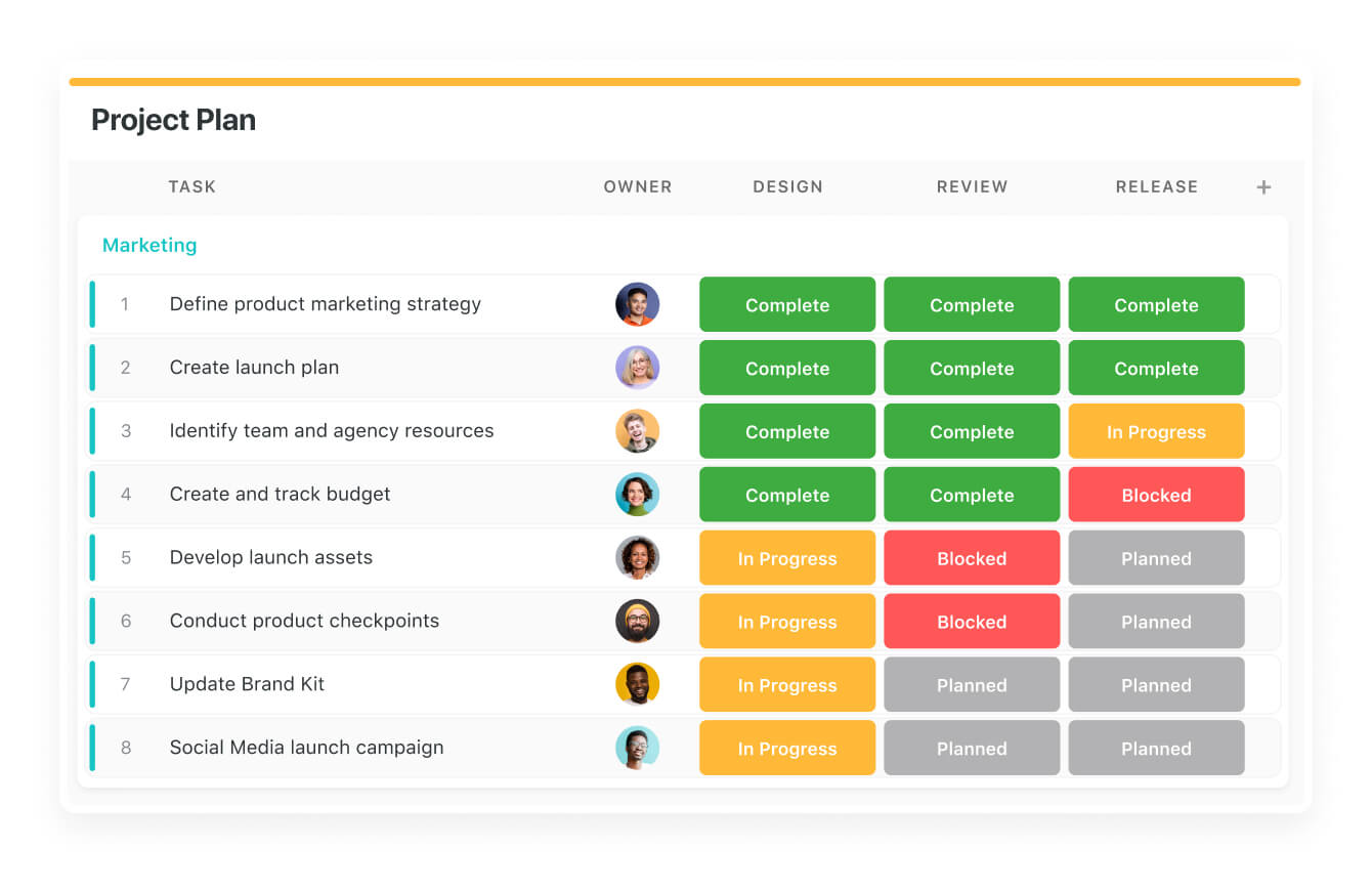
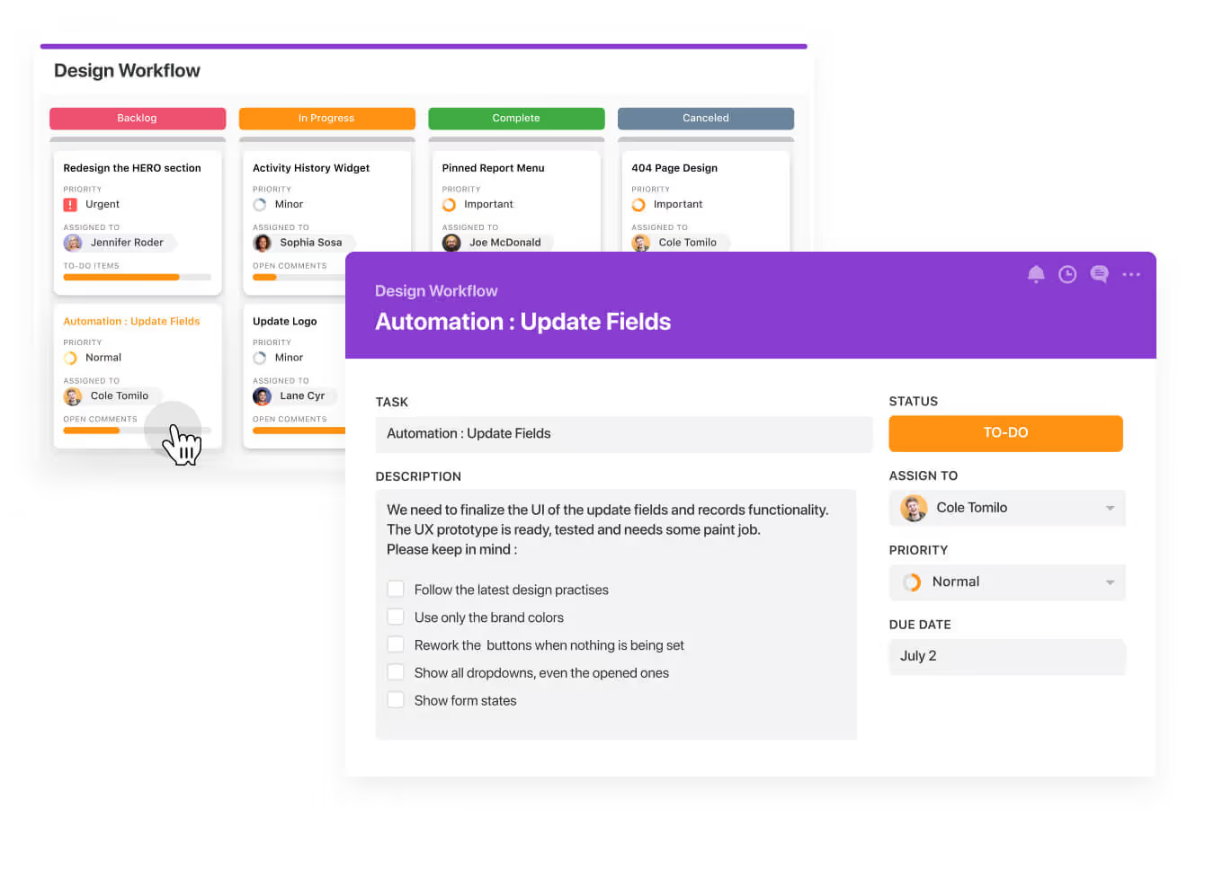
#1: Kanban View
Kanban View and Scrum Boards are perfect for visualizing a workflow through the different stages of work, tracking progress, and assigning tasks to team members to remove bottlenecks.
The concept of Kanban originates from Japan from the 1940s when it was used at Toyota to remove operational bottlenecks and ensure that the workers can move tasks from the ‘’backlog’’ to ‘’in progress’’ and then to ‘’complete.
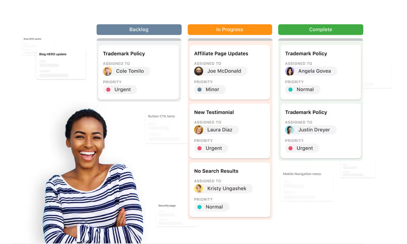
With SmartSuite, you can also group the tasks by status, such as ‘’minor’’, ‘’normal’’, ‘’important’’, and ‘’urgent’’ to better prioritize tasks for your team.
Such visual project boards have been the standard for IT project management for the last years and aim to provide a quick look at the tasks to be done by status.

You can then click on each specific task and expand its details to learn more about what’s required from each team member.
That way, you are reducing the large portion of the technical details so only the people responsible for the task have to read the task’s description.
Learn more about the Kanban boards at SmartSuite and how you can set them up:
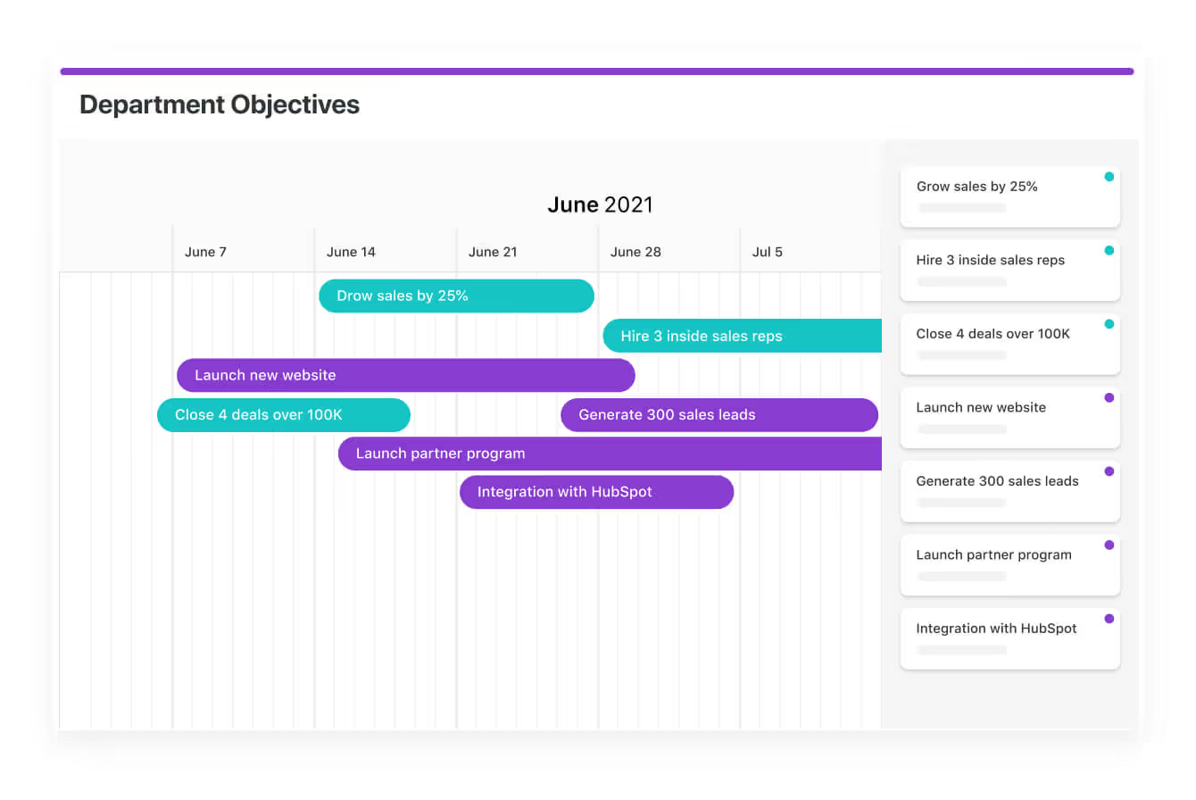
#2: Gantt Chart
You can use the newly popular Gantt Charts to highlight task dependencies with the chart’s dependency field, which automatically adjusts task timelines when changes are made.

SmartSuite’s Gantt Chart provides a 360-degree view of milestones and dependencies, simplifying complex project structures with drag-and-drop timeline adjustments for real-time flexibility.
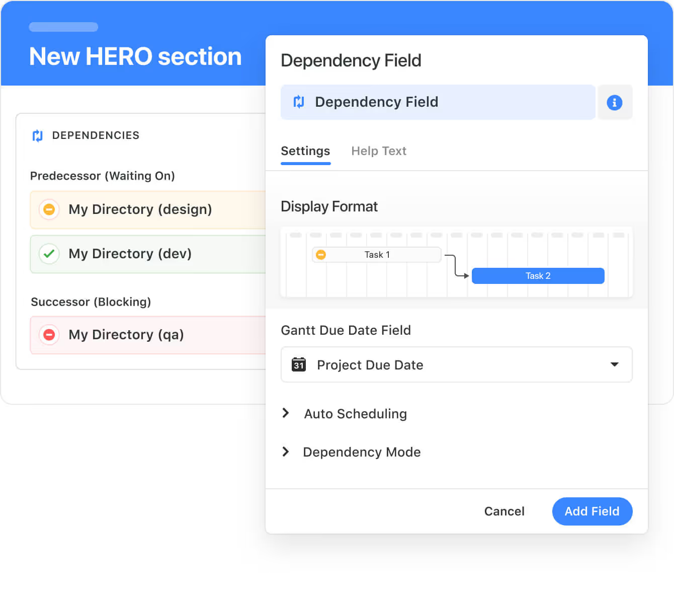
The visualization tool can help you optimize resource allocation by enabling you to visualize team workloads and potential bottlenecks for balanced task distribution.
➡️ Think of having to go through a website migration and having the SEO team as a dependency of tasks to be done before the developers can do their part (e.g., URL remapping of the old URLs to the new ones).
Learn more about SmartSuite’s Gantt chart view:
Our Gantt charts also have integrated communication features, such as task comments and updates, to let you collaborate with your team on the product roadmap.

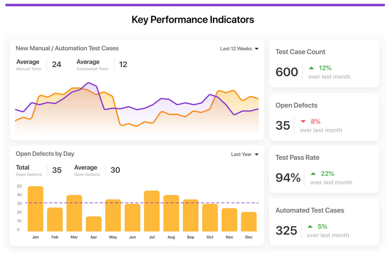
#3: Dashboards
Next up on this list, you and your team can build custom dashboards inside of SmartSuite to help your team get a project breakdown analysis by status and status for tasks like project budget vs. actual spend.
You can build easy-to-understand, visually thrilling views into your data or project progress.
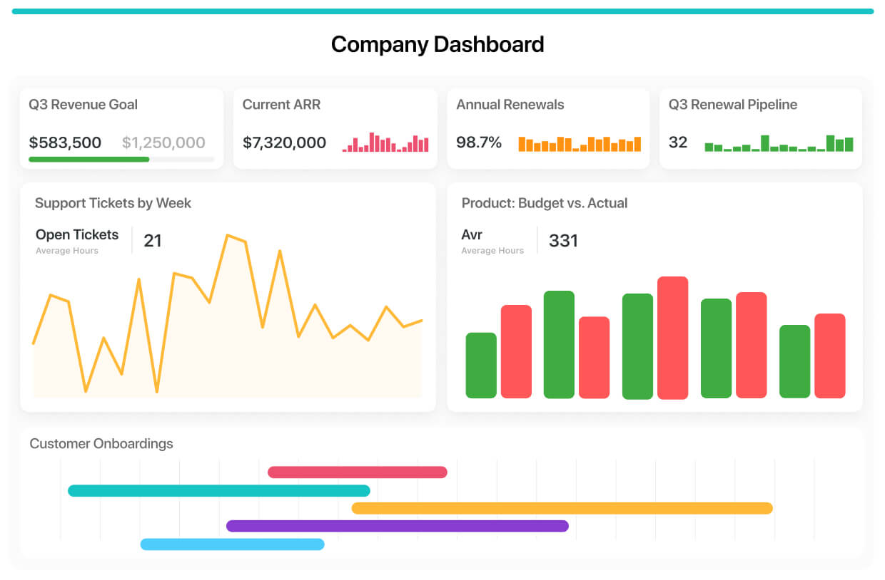
You can track project stages, stoplight status, roll-up status reports, and attach project documentation.
The reason why SmartSuite’s customers love the custom dashboards is that they can aggregate any of their data into a single view using our library of configurable visuals.
Your leadership team would not have to be digging for information because it’ll be right there in the dashboard – and you can choose how to display it.
#4: Mind Maps & Whiteboards
You can create a visual representation of your project management workflow via a whiteboard (also known as a mind map), which is ideal for top-level visualization of the workflow.
➡️ In SmartSuite, our team uses whiteboards when we want to pitch an idea internally about a process that we want to conduct or optimize.
Whiteboards can help your team get a bird’s eye view of the project management process and then be able to export it as an image.

You can check out how to create and use a whiteboard in SmartSuite:
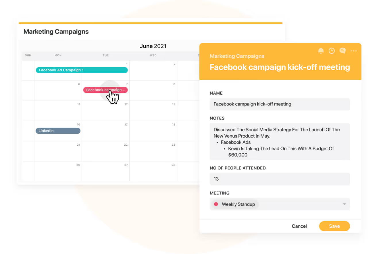
#5: Calendar View
You can use SmartSuite's Calendar View to enhance visual project management by providing a dynamic, interactive calendar that displays tasks and events through customizable date fields like Due Date or Date Range.
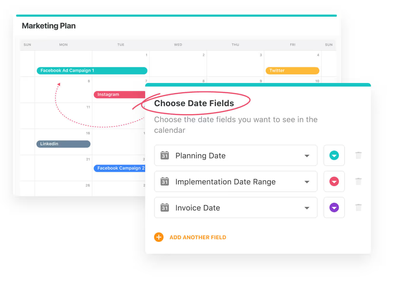
Team members can zoom between year-long overviews for strategic planning and focused week/day views for immediate task management.
➡️ I think of the calendar view as ideal for balancing long-term projects with daily priorities.
The drag-and-drop functionality of SmartSuite’s calendar view allows real-time adjustments to deadlines, while color-coded Spotlight filters help quickly identify critical items or categorize tasks by priority, team, or project phase.
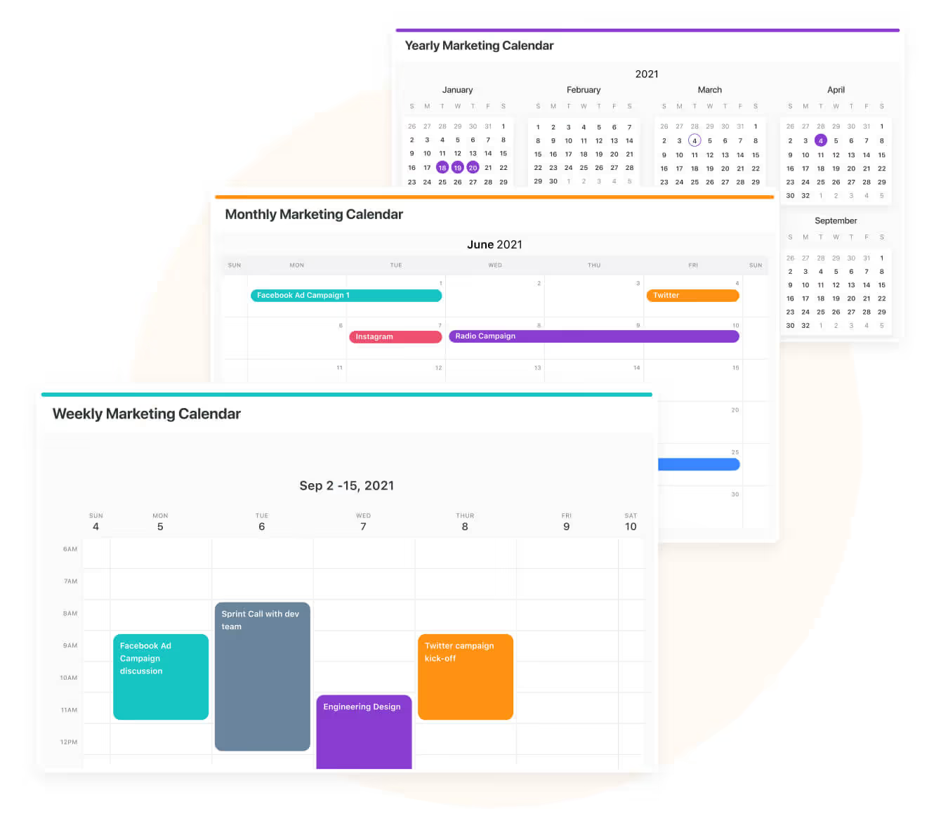
You can use our integrated record listings to enable seamless navigation between high-level schedules and detailed task specifications to maintain context without losing visibility.
By aggregating data from multiple tables into a unified calendar, your team can gain a consolidated view of cross-functional workflows and reduce scheduling conflicts.
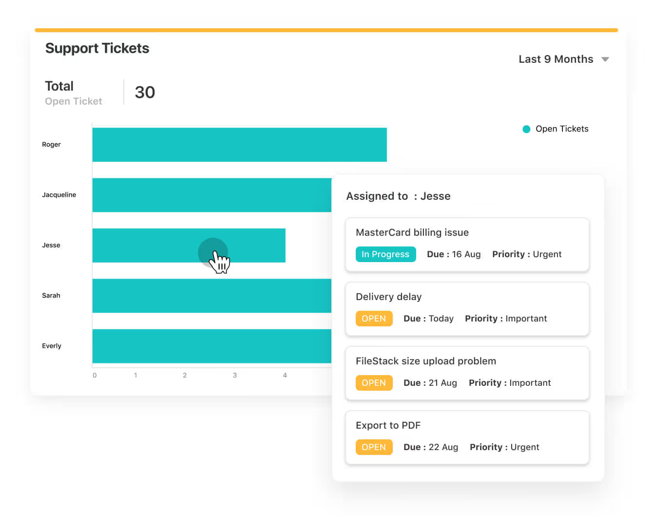
#6: Flowcharts (Chart View)
Your team can also use flowcharts (also known as Chart view in SmartSuite) to visualize your data with multiple chart types, from bar and line charts to bubble, heat map, and scatter.

Flowcharts can be used for the following purposes:
- Comparing items by shared data groupings with Bar and Column charts.
- Tracking values over time with SmartSuite’s Line and Area charts.
- Using Pie or Donut charts to assess how common items relate to each other.
- Diving deeper into some advanced options for viewing more complex relationships with Bubble, Scatter or Heat Map charts.
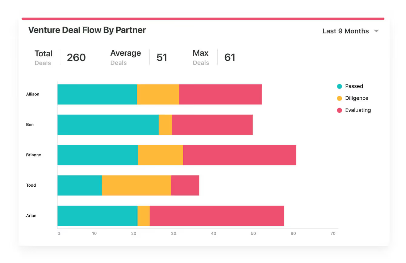
For example, by using a Bar Chart, you can compare items between groups, such as ‘’Support tickets by assigned customer support rep’’, and then track changes to values over time.
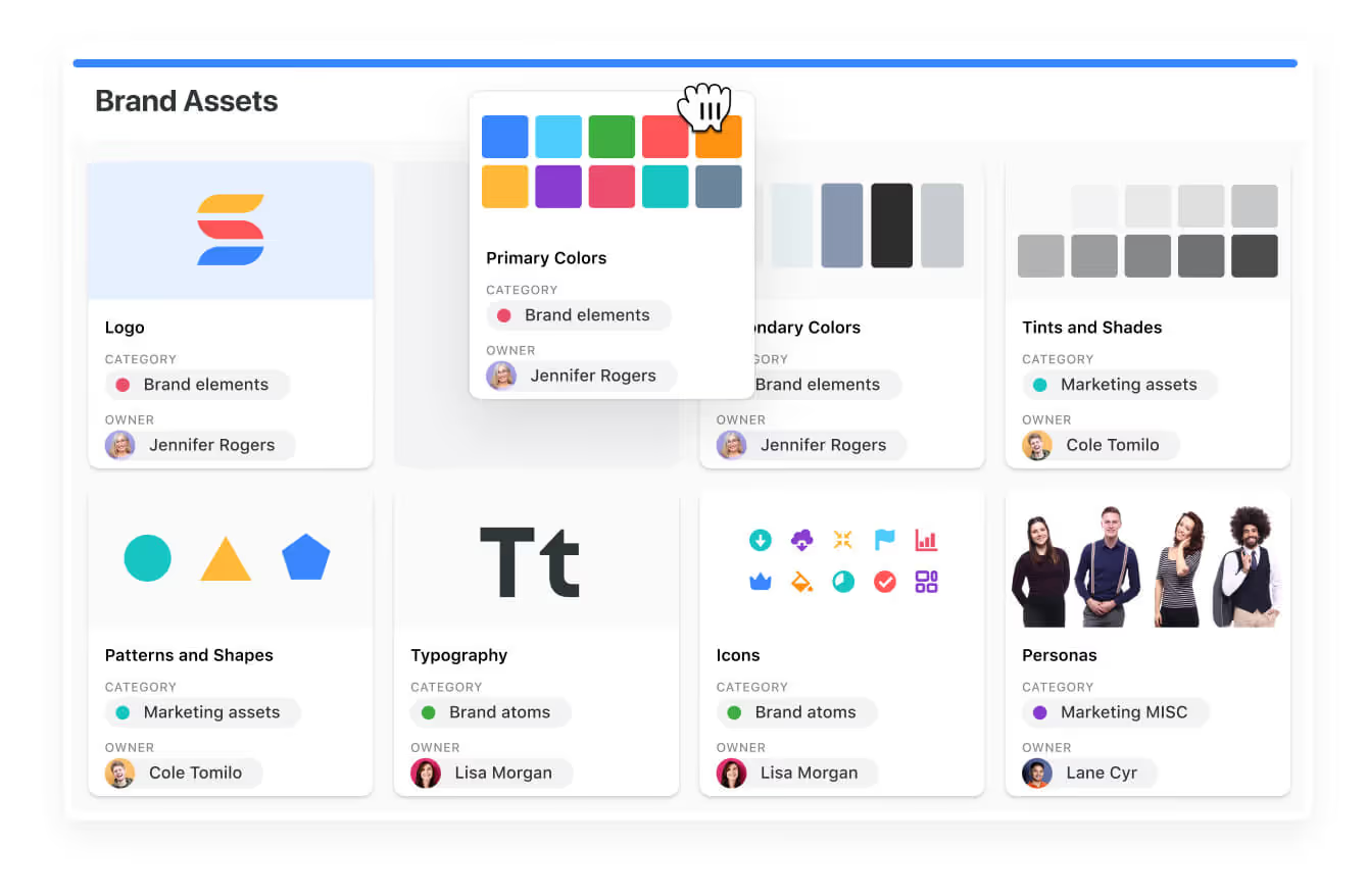
#7: Card View
An underrated way of using visualization for your project management is to use Card Views.

Card Views enable your team to view your data as visual cards that can include logos, images, PDFs, documents, and spreadsheets.
➡️ I think of Card Views as ideal for teams working with image-based content, such as restaurants looking for visual project management.
The beauty of the card view is that your team can instantly switch between card sizes and use the Fields to Display control to preview the most important information.

However, it is the customizability that is hitting the nail with this one. You can drag and drop cards into any order, and sort/group galleries the way you want.
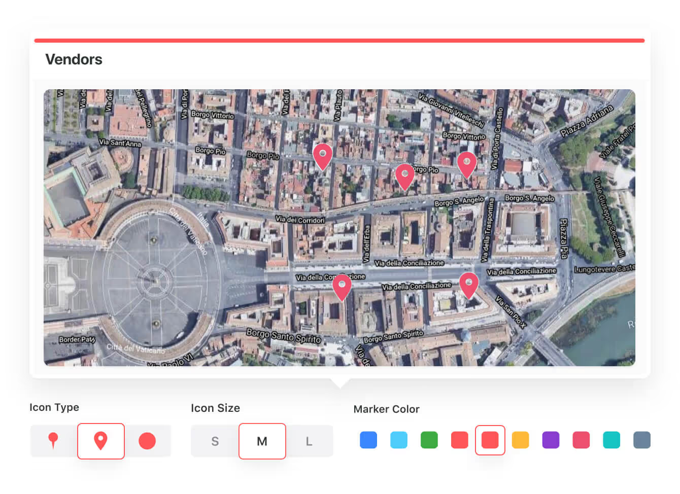
#8: Map View
Using a Map View is an interesting way to visualize your project management workflows if you work in real estate.
A map view lets you view any of your location data in a fully interactive map format inside SmartSuite, which includes powerful display features.
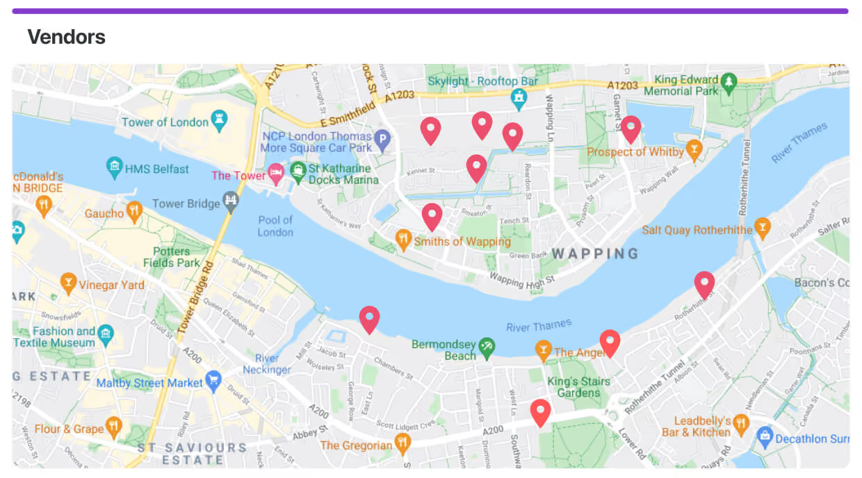
I find map views particularly useful for teams working on anything, from property management to deliveries and construction job sites.
The way it works is that SmartSuite automatically recognizes address fields and maps records geographically, displaying a pin and a preview of the address.
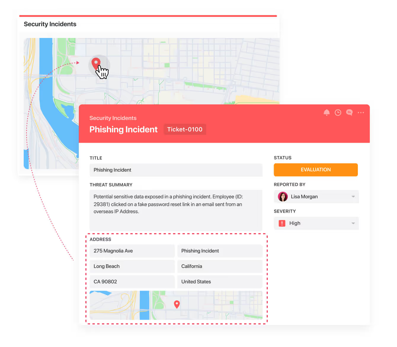
Your team can expand to view the entire record in the context of the map with a single click.
And the best thing about it?
You can customize your map elements inside SmartSuite, meaning that you can visualize your data exactly how you want to.
#9: Timeline View
You can use a Timeline view to view your projects and processes in a timeline format, which some teams find great for visualizing workstreams and schedules over a custom period of time.
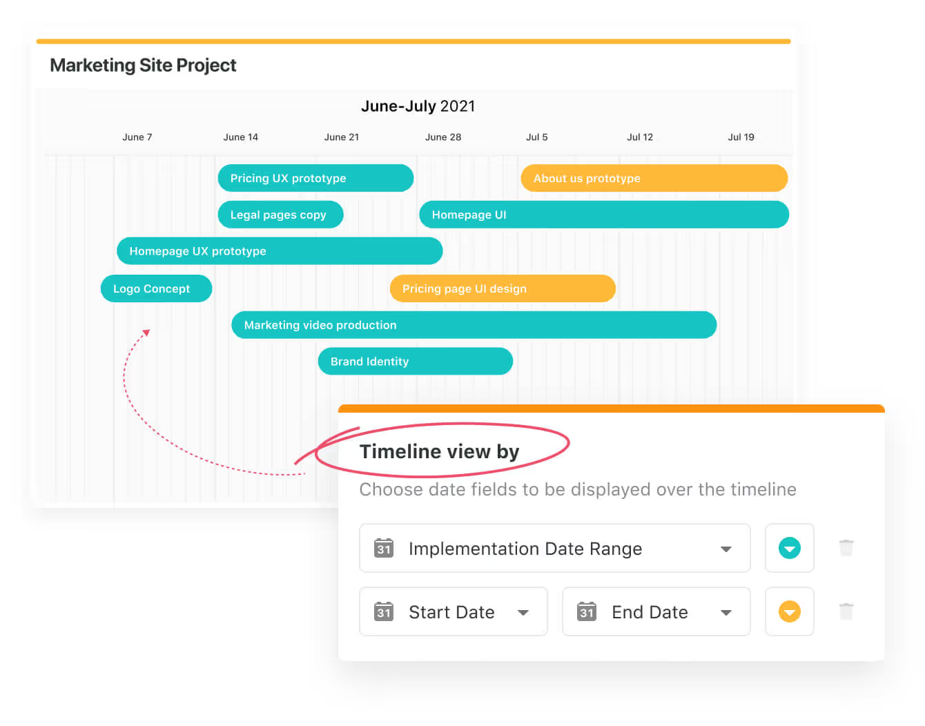
It is a more simplistic version of the Gantt chart, which aims to identify dependencies, manage competing priorities, and keep your team proactive on their deadlines.
You can use SmartSuite’s drag-and-drop timeline view by choosing a data range you want to display and colour-coordinating tasks.

You can also use the timeline view as a Gantt chart by visually grouping by any attribute.
I personally find this use case particularly useful when I want to view data with shared attributes, such as when I’m managing marketing campaigns.
Your team can then open the Record Listing panel with a single click, which displays all available data and/or tasks in your selected view, such as your plan for launching a new website.
#10: Grid View
Last but not least, the grid view: the visualization that helped us ditch the spreadsheets from the 1990s.
You can view projects and processes in a spreadsheet-like grid format with powerful sort, filter, group, and inline edit capabilities that make it easier to display data than a solution like Excel.

You and your team can easily drag and drop items to reorder rows and apply groupings on the go.
What’s more is that you can adjust columns in real-time, including re-ordering, re-sizing, or freezing columns, which are then being saved for consistent viewing for your co-workers.

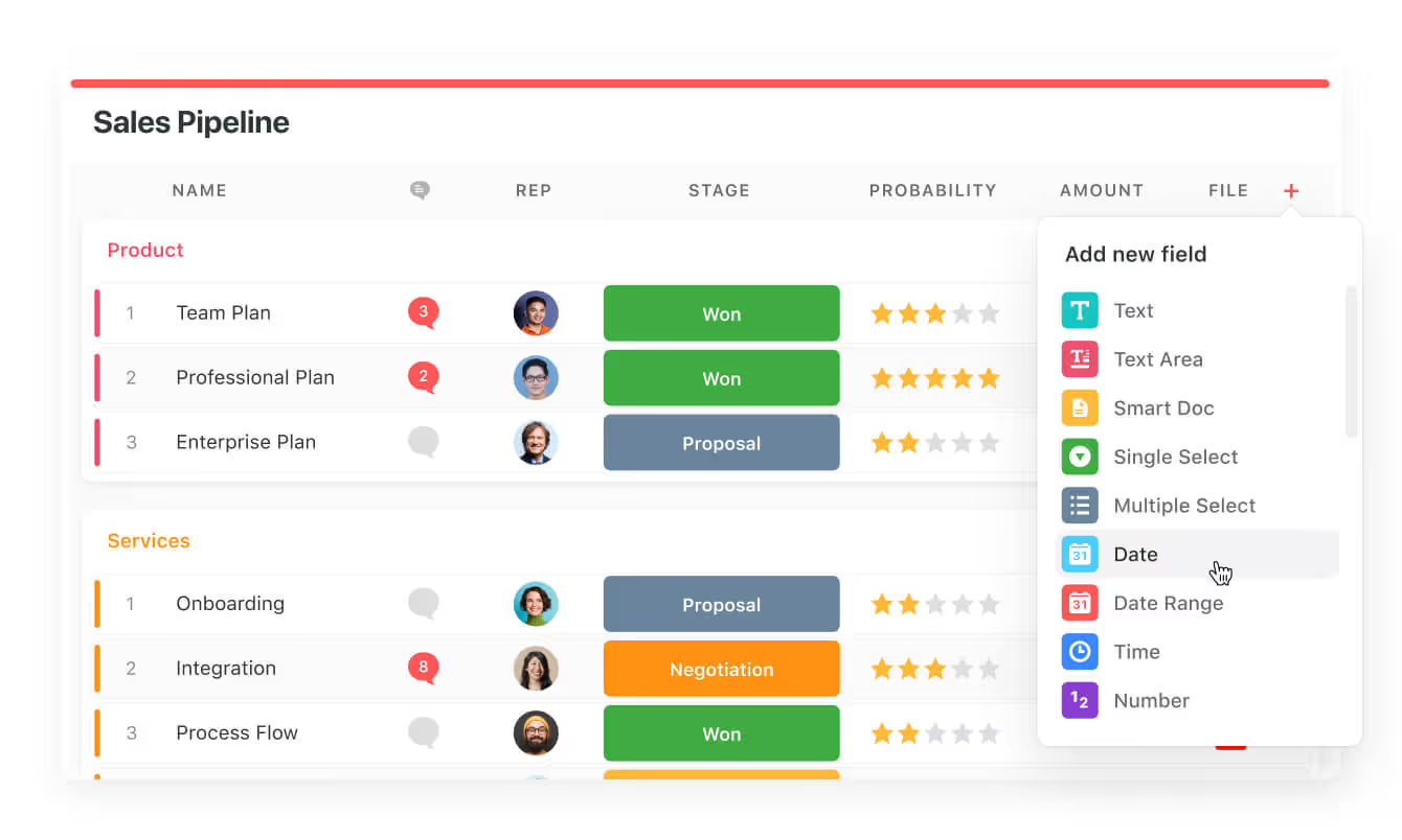
The reason why SmartSuite’s grid view is superior to other spreadsheet-like interfaces is due to our 40 field types that you can add via the plus button, including:
- Adding a SmartDoc.
- Adding a data range.
- Adding a timeframe.
And for collaboration’s sake, you can see open discussion threads for any record in a project or process so you can jump into the conversation and keep the project running smoothly.
In our team, we have ditched communication platforms like Slack for communicating about projects because our team can see the comments right there on the grid view.

Visual thinking: The psychology behind why visual project management works
The reason why the 10 project management examples of visual project management work in the current digital age is because of what scientists call ‘’visual thinking.’’
Visual thinking leverages the brain’s innate preferences for visual processing, as nearly half of the neural capacity is devoted to interpreting visual cues.
Put simply, visual project management helps us better understand the data and retain it in our brains compared to text-based documentation.
For example, when you see a sign on the road, you can quickly understand its meaning because it is designed to be visually clear and concise.

Image and data from Explain Visually.
By translating abstract concepts into diagrams, charts, or even maps, we reduce the cognitive load of the brain and allow our team members to identify patterns, dependencies, and bottlenecks more intuitively.
And it also makes for better co-operation with your team, since you can all look at the data and make decisions on the go, such as who should we chase for approval on this deliverable? Consulting teams will understand the struggle.
What are the benefits of visual project management?
The core benefits of visual project management include:
- Better communication with your team: Visual project management facilitates a shared understanding among your team members by presenting complex information in a clear and accessible format (e.g., Kanban boards make it easy to allocate tasks).
- Improved clarity and focus: Visual tools like Gantt charts simplify project information, helping your co-workers focus on key elements and reduce cognitive load.
- Increased efficiency and time savings: By automating tasks, such as scheduling and updates, visual project management tools save time and enhance efficiency. Your team would also not have to sit down and read through dozens of pages in Word about the project.
- Faster project completion and better resource management: Visual project management tools provide a clear timeline and layout, helping your team make informed decisions about resource allocation.
- Adaptability: Visual tools like Kanban boards offer flexibility for agile teams, allowing them to quickly adapt to new information or changing project circumstances.
Get Started with SmartSuite & Our Visual Project Management Templates For Free
Well, that was it – our examples, templates, and video guides of adopting visual project management in your organization.
SmartSuite’s platform offers just the right customization, native collaboration capabilities and a library of 200+ project management templates.
Here’s what's in it for your team when you try SmartSuite:
- Access to a generous free plan with features including multi-board views (Kanban, Chart, Map, Timeline, Card, and Calendar), 100 automations/month, and 40+ field types, including formula and linked record fields.
- No-code automation builder to set up to 500,000 trigger/action workflows.
- Built-in productivity tools, including time tracking, status tracking, and checklists.
- Team collaboration and planning tools such as whiteboards and SmartSuite docs.
- Resource management across projects and teams.
- 40+ field types, including the option to add your custom fields.
Sign up for a free plan to test the water or get a 14-day free trial to explore all its amazing features.
Or, if you’d like to talk to our team of experts, schedule a demo.
Read More
- The 10 Best Project Management Software For Engineers: We break down the top 10 project management solutions built with engineers in mind in 2025.
- 10 Best Healthcare Project Management Tools in 2025: Find out the best healthcare project management solutions on the market.
- 10 Best Project Management Software for Construction in 2025: A useful guide if you operate in the construction industry and you’re looking for a project management app.
- 10 Best Enterprise Project Management Software: Find more about the best Enterprise-grade project management solutions on the market.
- 10 Best Project Management Tools For Remote Teams In 2025: Learn more about the best project management tools for remote teams in 2025.
- 10 Best Project Management Tools For Consultants In 2025: Find out the best project management solutions for consultants.
SmartSuite provides work platform for standardizing workflows in the following areas:
- Governance, Risk & Compliance
- IT & Service Ops
- Project / Portfolio Management
- Business Operations