Visualize
Your Data
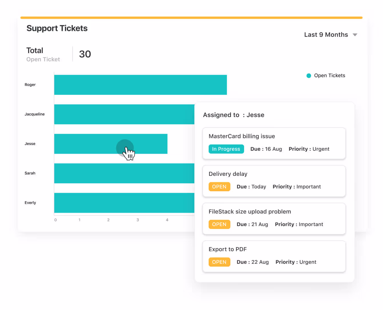
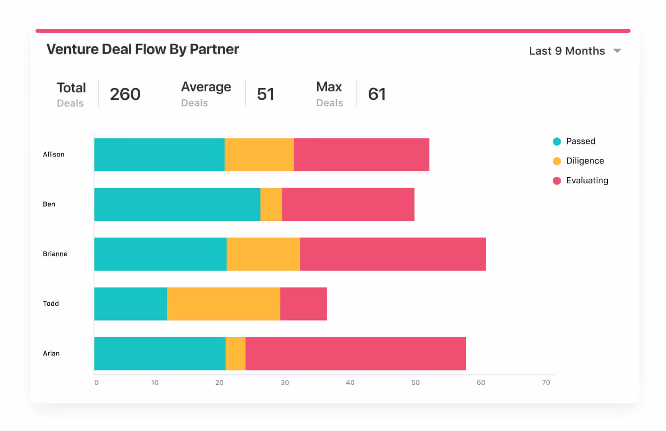
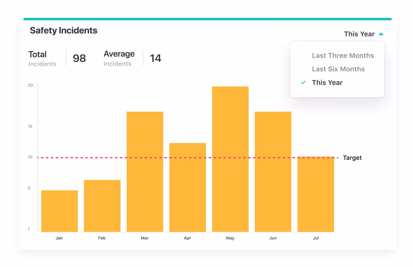
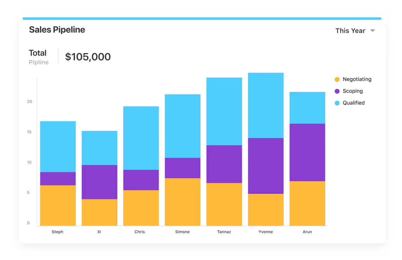
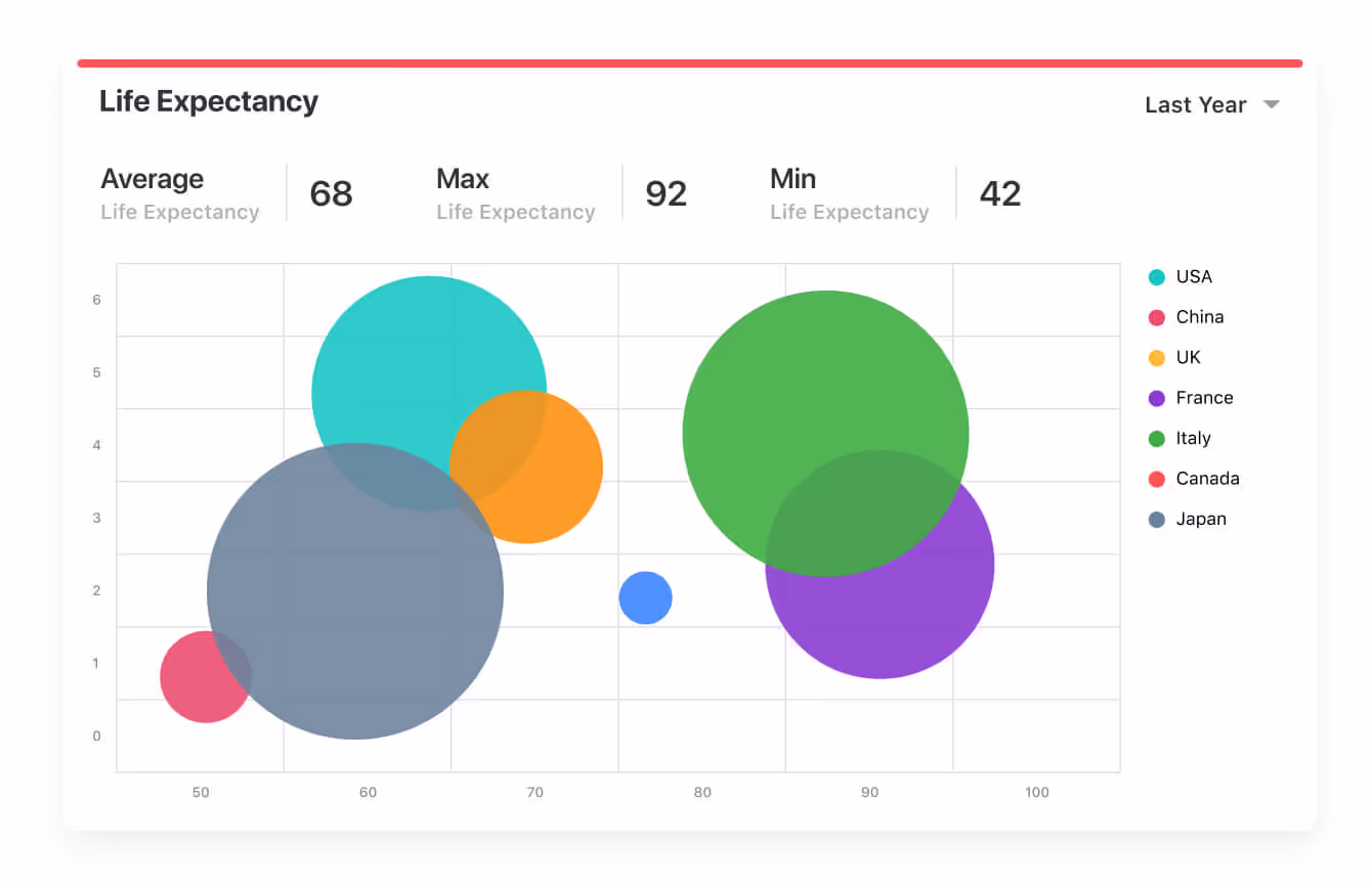
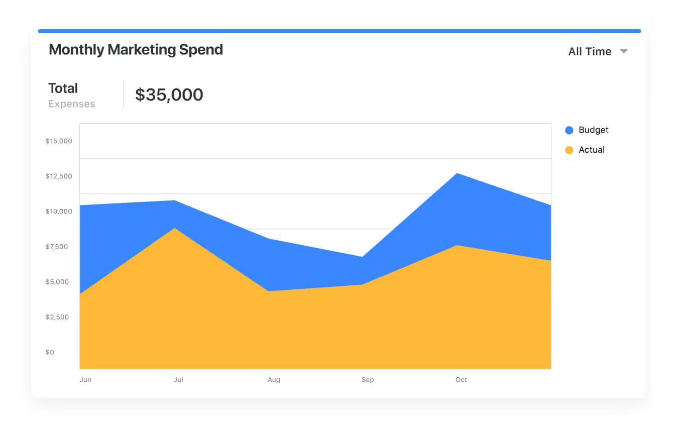
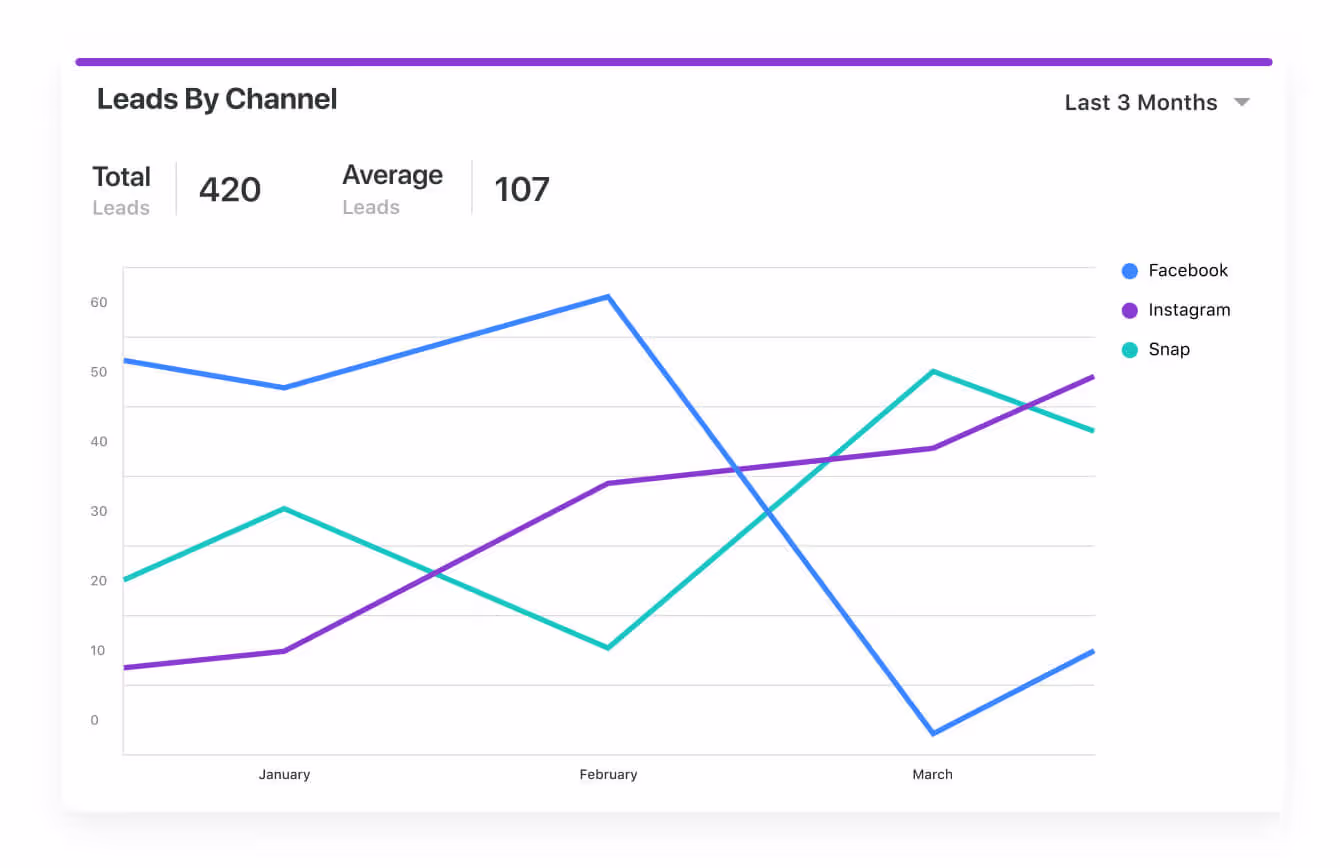
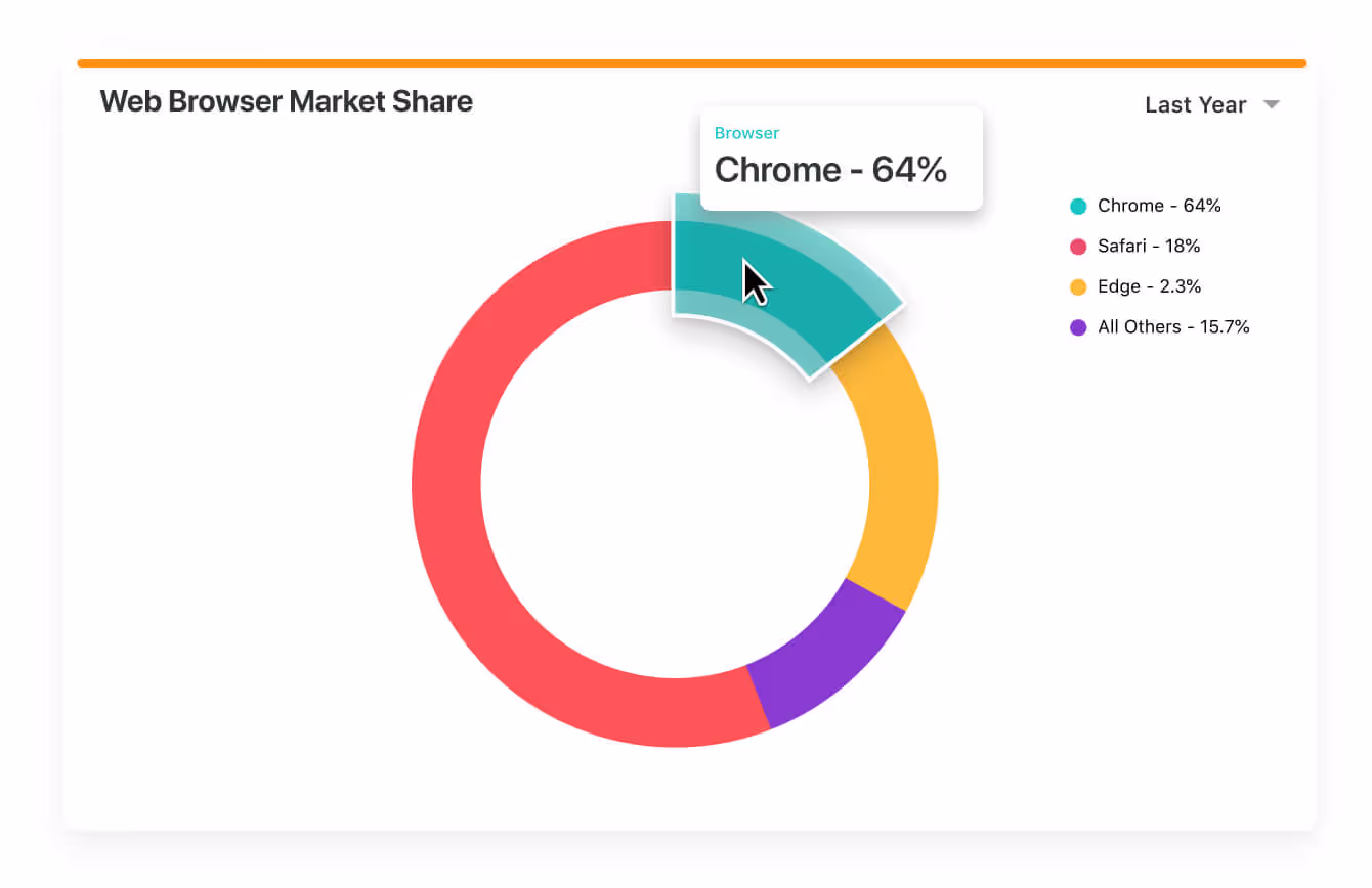
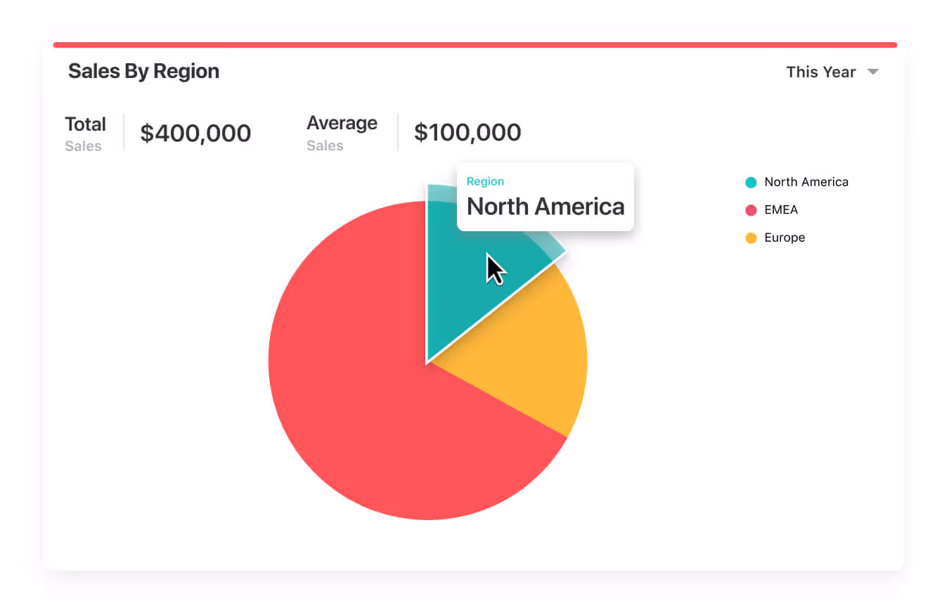
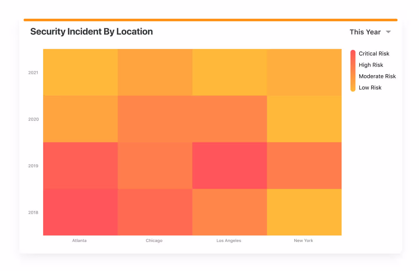
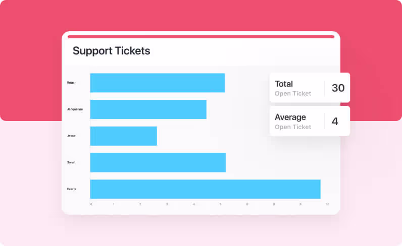
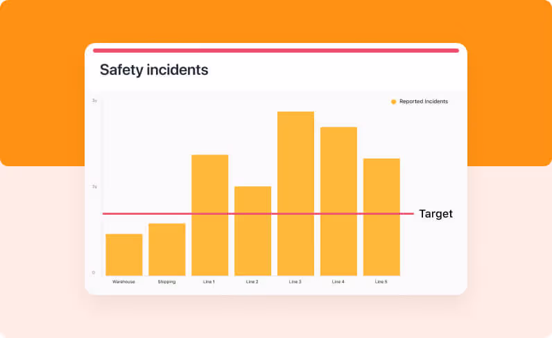
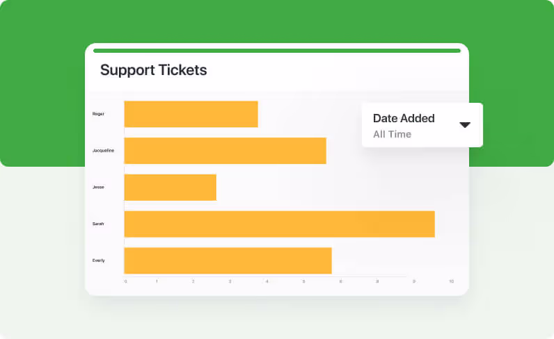
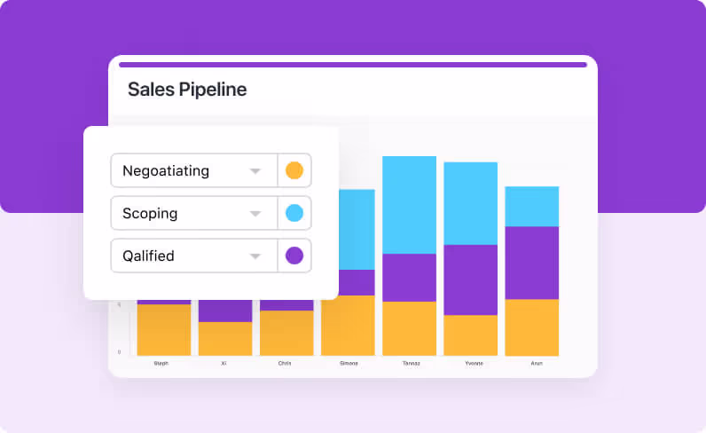
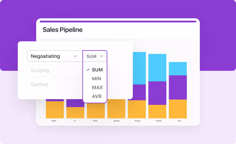
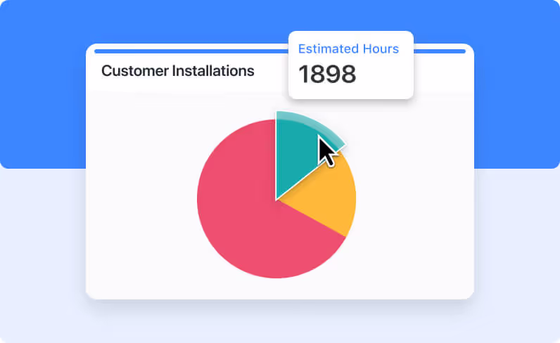
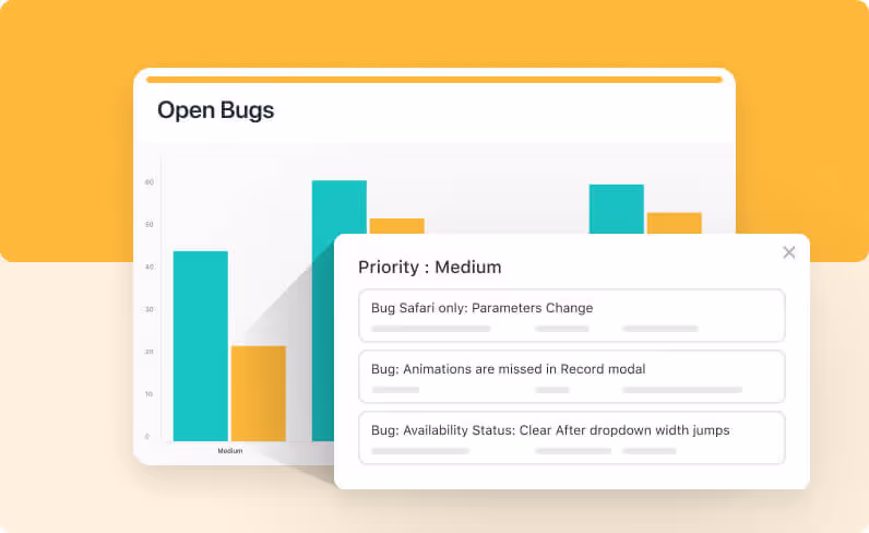
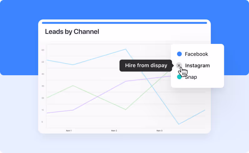
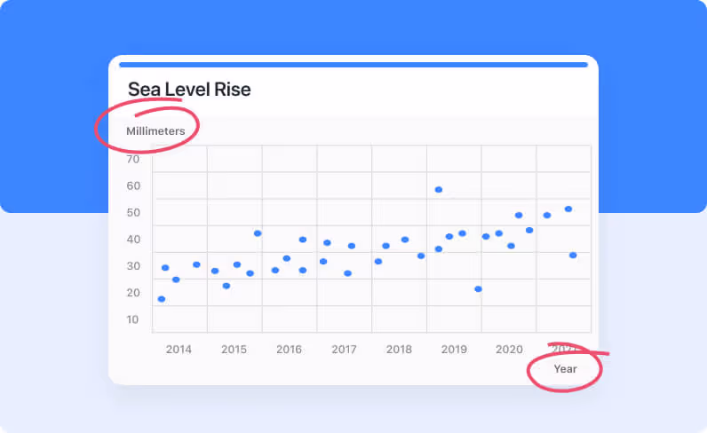
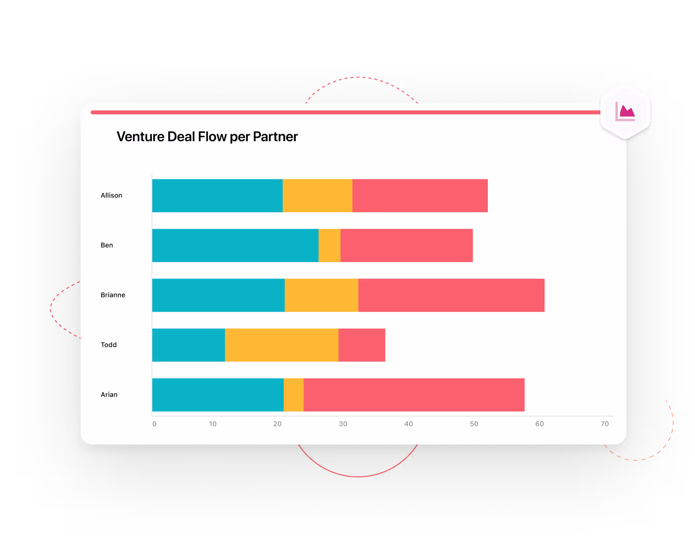
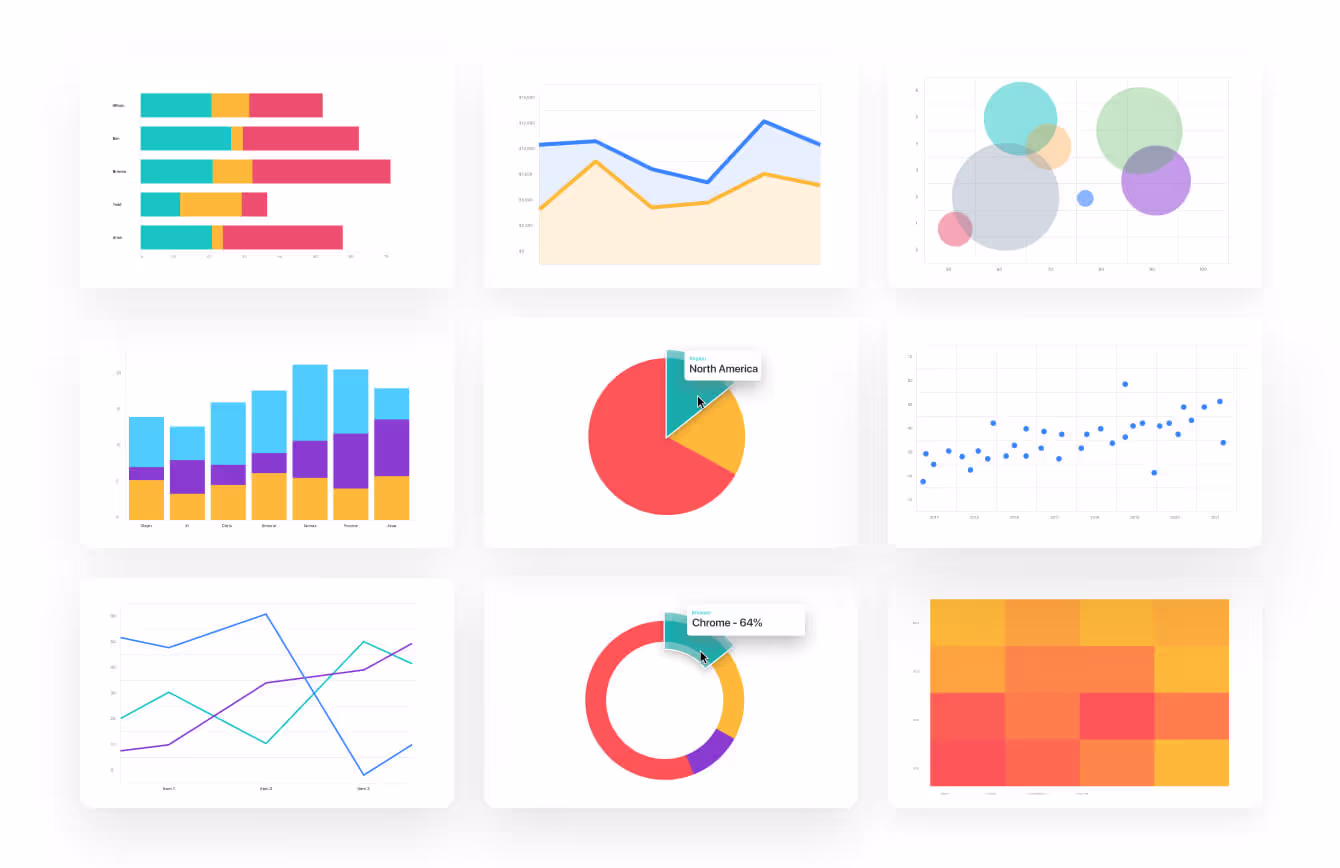
Compare items by shared data groupings with Bar and Column charts. Track values over time with Line and Area charts. Use Pie or Donut charts to instantly assess how common items relate to each other. Finally, dive into some advanced options for viewing more complex relationships with Bubble, Scatter or Heat Map charts.